Web design trends have been changing rapidly in recent years. Some things disappear for a while, only to make a comeback. That’s what happened with gradients — once obsolete during the flat design era, they regained popularity thanks to Google and its material design style. Multitone effects offer various variations and applications, almost all of which are successfully used in web design.
We briefly touched on the topic of gradients in our previous articles, when we discussed shadows and the creation of complex deformed shadows, as well as when we explored soft lines and shapes . But those discussions were general. Now we’ll take a closer look at gradients.
As an effect, the gradient is incredible in terms of its capabilities. Being a smooth blend from one color to another, it allows web designers to create virtually new hues and tones. This makes elements stand out, feel more realistic, and gain dimensionality in design. Simply put, gradients add depth to visual design compositions.
On the other hand, gradual blending with white or black (as well as playing with opacity) can simulate distance from a light source. Gradients are part of the real world because our world is not made up of flat, solid colors. Look around — you can see color transitions everywhere.

The Importance of Gradients for Designers
As already mentioned, gradients are making a comeback, and we are seeing them more and more — in branding, illustrations, typography, and UI. This applies to digital environments, since in print gradients aren’t as comfortable or popular. Gradients make a wider range of colors available to designers and users by blending to create new tones. It’s nearly impossible to convey the full richness of gradient transitions with printer output. Unfortunately.
But in the “virtual” world, gradients are attractive and memorable, colorful and playful — they create a whole new kind of composition that people aren’t used to seeing. It’s hard to even find the right words to describe how magical gradients can be. Since gradients are gaining unprecedented popularity in 2018, web designers will be using them to create amazing digital and graphic artwork.
Speaking of the rules for working with gradients, let’s highlight a few:

Gradient Examples from Around the World
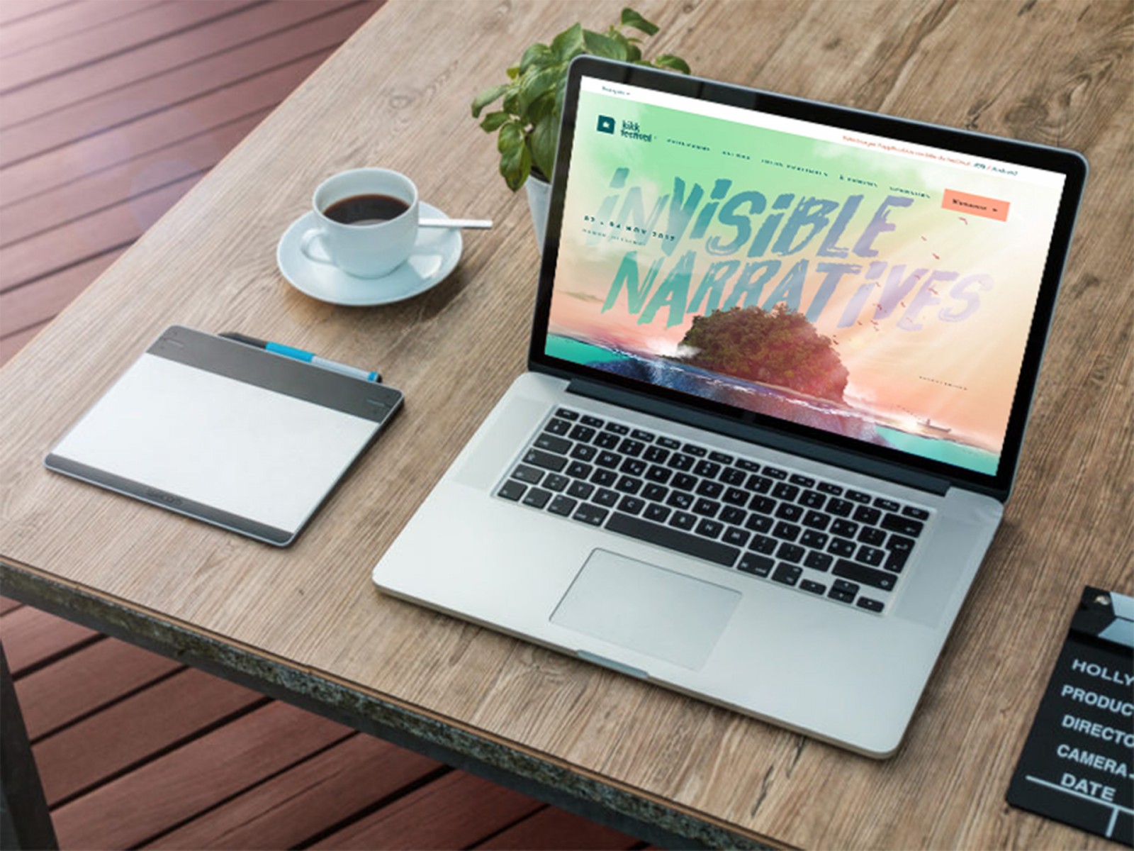
There are many websites that use gradients. It's not hard to find them on platforms like Awwwards or Cssdesignawards. But we’ve handpicked the most beautiful and interesting ones, in our humble opinion. These include Stripe, MadeBySource, Owltastic, OneJohnSt (animated gradient while scrolling), LewisLopez (different gradient animations per page), Comment, Viens-la, Julie Bonnemoy – Portfolio, Seeanoli, KIKK Festival 2017 (magical with animation), HEEDS.


As you can see, gradients are used as tint layers, backgrounds, part of the composition, and as dividers between sections on a page.
Gradient Resources
After seeing all this, it's only natural to feel inspired to create something similar yourself. And then the question arises — where to find ready-made gradients to load into Photoshop and use?
Freepik – offers a huge collection of gradients, including both sets and individual background images.

The Apple Gradients collection — a set of the main color transitions used in iOS and OS X.

Ocean Breeze Ps Gradients — a collection of ocean-inspired color schemes. The archive includes PNG files for preview and a GRD file with 140 color transitions.
JJ's Gradients-1 Skin Tones — a set of 126 gradients in skin tones. Quite an interesting collection, as it includes both pastel shades and tones useful for creating “soft” compositions.
Coolhue – a resource with a collection of ready-made gradients commonly used in digital environments and easily recognizable.

Grabient – not only provides a collection of ready-made gradients, but also allows you to customize them: choose gradient direction, color stops, and add new ones. The resulting gradients can be copied as CSS code, including hex codes and percentage stops. You can then manually recreate them in Photoshop.


Photoshop Capabilities
Once you’ve chosen a composition theme and selected gradients and colors, you’ll want to create something. Naturally, questions arise about how to achieve certain effects. Some may say it’s simple: pick an image, apply a gradient, choose a blending mode — and done. And in many cases that’s true. But we’ll look at something a bit more unusual.
Option 1
Choose the image you want — for example, mountain peaks — and use a selection to remove the sky. That is, select the mountains, invert the selection, and press Del.

We didn’t enlarge the canvas or move the mountains to a separate layer, we just resized the original image. For this case, that’s not critical. Invert the selection (right-click → Inverse), then use Free Transform (Ctrl+T), and while holding Shift, shrink the mountains and place them slightly above the bottom edge, centered.

Now let’s create a white layer under the image and add a Gradient adjustment layer to it.

We decided to use soft pastel tones, but if you have your own gradients, click the gear icon in the top corner of the gradient window and load the needed set. In this case, we used a mirrored style with zero angle and three colors.


Clean edges can be removed using a mask and a soft black brush. You can also adjust the image with Levels and Brightness settings.

If you reduce the Opacity and Fill values for the mountains layer, you’ll get a gradient overlay effect through the image. This helps it blend naturally into the background. But the exact values may vary, or you might not need this at all.

Apply a Gradient layer to the mountains layer too, this time using brown and green tones and a linear gradient style. Note: the bottom sliders control the color transition range, while the top ones control intensity. Also reduce Opacity and Fill for this gradient layer, or the image won’t be visible. This helps emphasize the greenery, light fall, and overall light-shadow play.

Create a text layer. If you place it above the Mountains (with gradient) layer, it’ll look dull. If you place it above the background gradient, it will take on the background’s colors — neither is ideal.
So instead, move the text layer above everything and rasterize it ( right-click → Rasterize Layer ). Then apply a simple linear gradient from black to transparent. Of course, you can choose any font, size, or style. This is just an example. Don’t forget to experiment with Opacity and Fill. Since we’re working with soft tones and light/shadow, it’s better to avoid harsh contrasts.


On new layers, paint birds with brushes and optionally add sunlight rays to bring the image to life. When adding any light source or light spot, be sure to refer to the base image. If you have a single object (e.g. a tree) and the light hits it directly, you can pick the direction yourself. But in this case, the light is slightly side-lit.


You can also add animation, tweak gradients, adjust Saturation or Brightness, reduce intensity, and more.
In this simple way, gradients allow designers to create imaginative and beautiful visuals for web design. A logo can easily replace the text.

In short, the number of ways to use gradients is vast — but it’s best not to overuse them in a single composition.
Option 2
Since gradients can be applied not only to 2D images but also to 3D ones, a logical question arises: How? Earlier, we explained how Photoshop can transform a flat image into a three-dimensional one. But let’s imagine for a second that you want to make a solid color look iridescent (i.e., apply a gradient), and the object should look… unusual. Moreover, as we know, working in 3D mode requires a powerful computer. But what if it doesn’t? What if you don’t need it? Imagine creating a 3D-looking object using just a brush.
Create a new document, apply a Solid Color adjustment layer and choose a dark shade for the fill. The background can also be light, but it must contrast strongly with the object color. We chose dark blue. Delete the background layer, leaving only the Fill.


Create a new layer, select the Elliptical Marquee Tool and while holding Shift, draw a perfect circle. Remember to release the mouse button first, and then release Shift.

Don’t deselect! Go to the Fill option → Gradient, and double-click it in the top panel. Choose a default gradient or create your own using a bright saturated color and a light one (monochrome). We used bright pink and dark pink. Drag vertically through the circle using a linear style.


Press Ctrl+D to deselect and add a new layer.
Now prepare the brush. Select the Brush Tool → Mixer Brush, and in the top toolbar choose “Dry, Heavy Load”, set Wetness to 0, Load to 100%. Uncheck Sample All Layers — otherwise the brush will pick up the background color and become blue instead of pink.

Choose a standard hard brush and open the Brush Settings panel. Set Spacing to 1%. If not set, brush strokes will be visible and ruin the smoothness.

Set the brush size roughly equal to the circle’s size (± slightly). Hold Alt and click on the circle — this samples it into the brush. You’ll see on the panel that the brush has picked up the shape with transparency.

Add a new blank layer and… draw with the brush. If you struggle to make smooth curves manually, use the Pen Tool and stroke the path with “Simulate Pressure” using the Mixer Brush as the source.


You can then change the colors of finished elements by adding adjustment layers.

Using this simple method, you can create volumetric shapes that can be arranged in creative compositions. You can also use ready-made shapes ( Custom Shape Tool ), but in the top bar, choose to draw only the path so it can be stroked later.


Conclusion
What’s most important in web design evolution? Human perception of color and how it combines with other hues and shades. This makes color one of the most powerful design tools — both in the real and virtual world. Understanding this means designers must always observe how design evolves, how trends change, what people like or dislike, and who sets the tone in color use.
Gradients allow users to perceive color as something dimensional, even on a flat screen. They bring life to ordinary photos, and simple visuals gain realism. We’re used to seeing how sunlight plays across mountain slopes, knowing that a photo only captures a single moment. But if you add gradients of light and shadow, glows, and shades, it might feel — even for a moment — that the image comes to life. On a flat monitor, this feels magical.
Apply a gradient to a plain background and you’ll get depth — and users may even feel tempted to peek behind the edge of the screen: “Maybe there’s something more there.”
The role of gradients is vast, and their use in Photoshop is nearly limitless. Which means web designers can create unique projects more easily — because every individual gradient already feels like something new.