“Sticky” menus, fixed sticky navigation, pop-up menu bars — there are many names for just this one trend. But the idea is simple: no matter how long the page is or how far the user scrolls, the menu bar always stays with them, always in view.
Not all users — or web designers — like this style, since the menu takes up some screen space that could be used for... other things. But from a UX perspective, a sticky menu offers quick and easy access to all navigation links from anywhere on the page. In practice, it’s convenient, even if in theory some might argue it’s not strictly necessary.
At the same time, sticky menus work great for mobile versions of websites, since those pages are narrower and often longer — meaning that navigation links should always remain visible and accessible.
Still, while the core idea is that the menu stays in view, designers implement it in a variety of creative and refined ways. In this article, we’ll explore original and polished examples of sticky navigation and some unique design choices.
Ascensión Latorre
You don't need to speak Spanish to admire the design of the Ascensión Latorre website. At the top of the page, you see a logo, name, and navigation links. But as soon as you start scrolling, the navigation stays fixed, while the image and text fade away.


It's small and takes up very little space — making it perfect for heavy graphic menus. It would be nice to see a small animation that shrinks the logo — Pegasus would still be recognizable, and the menu would save even more space. We'll show more examples of this later.
Search Engine Journal
A great concept and execution. It’s a blog with a menu bar that’s always in sight. You’ll find animations, transitions, and multiple variations in the navigation layout. On the homepage, there's an animated logo that also serves as a download button for the journal. As you scroll, the logo reappears on the left and the menu items shift to the right.


The shifting of links brings a bit of life and lightness to the layout. It’s well-thought-out — subtle yet effective. The links and dropdown menus themselves are kept simple and plain. A more complex version could have created visual overload, like trying to combine every design trend into one site.
AWD Agency
On first visit, you might think the site has no menu at all — it looks like everything’s on the main screen. You pick a model's photo and read the info. That’s it.
But check out the logo on the left. It's not just a logo — it's the menu. A vertical strip of navigation that’s always there, disguised as the logo icon. It works great on desktop, mobile, and even 4K displays. The menu is always on the side, always visible, and always looks the same.


It’s one of the simplest ways to implement a fixed vertical sticky menu — without relying on the now-overused hamburger icon. Here, the logo and menu are one and the same.
Novotel Hotels
There are countless hotel and hospitality websites — we’ve covered them in detail in the blog and explored their design and UX features. But Novotel’s site stands out for its style and usability. At first, you see a top menu bar with a logo and login. Then, as you scroll down, the booking bar (originally located below) “sticks” to the top and merges with the navigation bar. Very cool — and very user-friendly.


What’s more, this design can boost bookings by keeping the reservation bar visible — increasing conversions compared to competing sites.
FHOKE
FHOKE’s site has a very basic sticky menu setup. But no matter how far you scroll, the logo and menu icon stay in view — and that’s it. No links, no animations.


The beauty is in the transparency. The navigation bar has no color — it blends with any background, image, or video. This creates contrast and focuses attention on the content, not the menu. When users want navigation, they just glance at the top-right corner — the word MENU changes color based on the background.
Brit + Co
Here, designers added auto-hide functionality to the sticky menu. As soon as you scroll past the browser window’s visible area, the menu disappears. It doesn’t interrupt content or beg for attention like “ click me! ”

But the moment you scroll upward, the menu reappears instantly.

Another neat detail: the search feature. It appears as a small icon, but expands into a sliding search bar. Super simple — but eye-catching and effective.

Prollective
A minimalist vertical sticky menu that’s so elegant, it makes you want to stay — even if the site’s content isn’t what you’re looking for. Visit Prollective and check the top-right corner. Simple column of links — that’s it.

No scrolling logos, no search bar — just content and those links. If your site is small with just a few pages, this might be the perfect sticky nav solution.

This saves space without top or side bars, yet keeps key links accessible at all times. Minimalism, simplicity, elegance, and clarity — all in one.
And finally, a highly animated and artistic implementation.
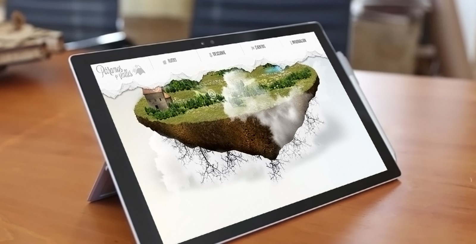
Paramos y Valles
This interactive project immediately impresses with animation, artistry, and graphical flair. The navigation bar is styled like a torn piece of paper. It shows not only menu sections but all the links within them.
As you scroll (any page), the menu visually shrinks. The logo doesn’t resize directly — instead, the white space around it disappears, creating the illusion of a smaller element. Menu links also vanish, leaving only the core sections.


In short, the menu starts out large and full of links. As you scroll, all the padding is trimmed, and what remains is a slim ribbon. It’s clean, fresh, and unique — you won’t find many others like it online.
When Sticky Menus Are Needed
A “floating” menu isn’t a trend in the usual sense. It either exists on the site or it doesn’t. It’s not hard to build, and many templates already include it. So no, it’s not a hot new trend. But the variety of implementations gives designers a wide canvas to work with.
If your site is large, with lots of sections and links, sticky nav is ideal. It prevents crowding links in corners or splitting them across header and footer. And yes — sticky menus improve time-on-site and conversions by keeping navigation handy.
The key is: don’t let your nav bar take up too much space. If it’s large, it should shrink as users scroll. People come for content — so your nav shouldn’t block it.
Take US Magazine, for example. Their nav bar is pretty big — but when scrolling, it gets smaller. The logo resizes too. This makes the menu less intrusive. People already know where they are — but still need quick access to links.


Final Thoughts
Sticky navigation is a handy, attractive, and functional design feature. It boosts UX and gives designers a playground for creativity, animation, and innovation. But it also serves practical goals.
You don’t see sticky nav everywhere — maybe not as much as you should. But where it is used, it’s usually helpful. Some sites mess it up by not snapping the menu to the top edge, leaving a distracting gap that blocks content — which you should definitely avoid.
The beauty of sticky menus lies in their minimalism, simplicity, and function. Add just a little animation, and you elevate the design with modern flair and polish.