Когда вы интересуетесь дизайном (любым) достаточно длительное время рано или поздно начинаете замечать циклический характер тенденций в отрасли. Как в моде, так и в искусстве, то, что выходит из тренда, неизбежно всплывает через несколько лет и, не успев стать принятым мейнстримом, снова устаревает и исчезает. В мире цифрового дизайна все происходит точно так же и не заметить рост и падение популярности градиента сложно. При этом он до сих пор считается краеугольным камнем дизайна интерфейса из девяностых (сколько различных сайтов того периода имели заголовки с градиентом WordArt (который и сейчас можно настроить в том же MS Word) ?). Но… эта тенденция, вероятно, имеет более глубокие корни.
Логотип «Назад в будущее» является достойным примером для тенденции дизайна, которая совсем недавно снова стала актуальной, в силу разных причин. Пожалуй, в первую очередь, касается это редизайна логотипа Instagram в 2016 году, а также и в оформления дизайна сайта Spotify.


Градиенты становятся все более и более популярными (уже который год их слава не меркнет, а только растет и растет и в грядущем году продолжит набирать заметные обороты) и в пользовательском интерфейсе веб-дизайна, и по весьма уважительной причине – они добавляют одним своим присутствием глубину и текстурность элементам на странице. Каждый из них уникален сам по себе и способен на выполнение разных задач: имитирование реальных цветов, которые мы видим вокруг себя (редко мы сталкиваемся с одиночными тонами в реальном мире), добавление капли фантазийности и сказочности, поскольку не все сочетания тонов мы, наоборот, можем встретить в реальном мире.


Градиент представляет собой мощный метод проектирования. Но как это обычно бывает в жизни – с большой силой приходит большая ответственность. При неправильном использовании, градиенты способны создать настоящую дизайн-катастрофу. Макет получится запутанным, пользователь будет отвлекаться, не говоря о том, что разрушится эстетика интерфейса.
Большое начало получилось в этот раз, но мы решили более пристально посмотреть на секрет создания градиента, который способен перевести дизайн на новый уровень, а не напоминать пользователю о 1997 годе. Мы уже рассказывали о градиентах, где их применяют, какие ресурсы есть, как в Photoshop его использовать для создания теней. Но о том, каковы секреты создания идеального сочетания – расскажем именно в этот раз и попробуем на примерах разобраться в некоторых деталях, что были упомянуты ранее.
Фундамент – основа основ
Является ли ваша идея дуплексом (два тона) или мультитоном, каждый градиент так же силен в возможностях, как и каждый его цвет в отдельности. И для определения сочетания подходящих цветов можно обратиться к цветовому колесу. Не будучи «всезнайкой» в колористике, достаточно помнить одно общее правило, которое мы так часто повторяем: близкие цвета гармонируют друг с другом лучше всего. Неважно, подбираете вы просто цвета для веб-дизайна или же решили создать градиент. На диаграммах ниже бесшовный переход от желтого к оранжевому цвету сравнивается с зелено-фиолетовым переходом. Во втором варианте слишком много промежутков, а часть цветов попросту теряется. Соответственно, фиолетовый и зеленый выглядят как два самостоятельных (каждый сам по себе, а линию стыка «размыли»).

Почему рядом расположенные цвета на колесе так визуально привлекательны? Может быть потому, что это именно те градиенты, которые естественным образом происходят вокруг нас. Что приводит нас к отличной дизайнерской тайне: посмотрите на природу, пройдитесь в ближайшем сквере или по соседней улице (не говоря уже о парках, лесозонах и иных местах) и используйте её (природу), как источник вдохновения.
Природа-помощница и интернет-знаток
Мы постоянно изо дня в день сталкиваемся с градиентами в нашей жизни: небо, закаты, водоемы. Независимо от того, где мы находимся в мире, небо, особенно оно, служит отличным источником материала (даже в зимний период, вечерами, когда много загорается иллюминации, что дает отблески на небесный покров). Просто взгляните на захватывающие природные градиенты, и идеи их использования в веб-дизайне вспыхнут сами собой. Яркие или пастельные – они смогут преобразить веб-дизайн, немного разнообразить обычный вариант, где использовались несмешанные тона. Если взять за основу одно только небо, конца-краю нет в составлении градиентов. Их множество.


С другой стороны, существует много веб-сайтов, с уже созданными собственными версиями градиентов, которые выглядят очень хорошо.
Impossible Bureau – как только вы откроете главную странницу, то увидите градиент, который совершает прекрасные переходы между красным, розовым и фиолетовым.

Melanie.F – в самом начале сайта можно увидеть градиент от зеленого к голубому. Градиент не яркий, но он сразу же привлекает внимание пользователей. Кроме того, и отдельные объекты также имеют цветовые переходы.

Symodd – обладает домашней страницей, что окрашивается в оранжевый и розовый, а последующие страницы продолжают утопать в различных цветосмешениях.

Переход на следующий уровень
Скажем просто, бывает, что цвет вашего бренда не совсем подходящий для градиентов на страницах сайта. Или, с другой стороны, ваш стандартный двухцветный градиент просто не контрастирует с данным логотипом. Иными словами: никогда не бойтесь экспериментов, добавляйте дополнительные оттенки в градиент для повышения его визуального интереса и выделения пользовательского интерфейса еще боль
Как несложно представить, дополнительные цвета лучше всего сочетаются, когда размещаются между начальным и конечным цветом на цветовом колесе. И вот для наглядности еще один вариант диаграмм. Во втором и третьем варианте все цвета находятся рядом, они создают естественный переход и смешивание. Но что первый? Желтый и синий – не самые близкие цвета, но и серый между ними выглядит, как некий разделитель. То есть, получается, что создан просто трёхцветный блок, где серый разделяет светлый и темный. Но это никак нельзя назвать естественным переходом из одного в другой. Понимание смысла градиента – ключ к успеху в его создании.

Но два-три цвета бывают скучными. Хочется чего-то большего и насыщенного. Но чем больше цветов вы добавляете, тем более сложным становится и градиент и тем сложнее конструкция по распределению цветов на холсте, сложнее и его использование на странице или в элементе. Легко придумать: в каждом углу по цвету. А в середине-то что? А как смешивание будет происходить в середине граней (сторон)? Вы можете поставить перед собой «наполеоновские планы» и стараться долго подбирать сочетания. Но в конечном счете получится у вас нечто несуразное из-за переизбытка тонов, от получившейся аляповатости.
Свет и тень
Даже после того, как удалось найти и выбрать идеальное сочетание цвета, остается еще вопрос о его реализации в конструкции.
Сравните варианты наложения градиента ниже. С помощью линейного типа можно сделать акцент на строке меню или просто создать тонировку. Радиальный же тип попросту непонятен в данном случае. Фразы в границы центрального цвета не умещаются, выделение объекта (акцент) из множества тоже остается непонятным.


Аналогично применяется градиент и для кругов. Линейный выглядит слишком резким и, словно бы, «разрезающим» фигуру, но радиальный выглядит как раз естественно.


Разумеется, что всегда при работе с градиентами необходимо назначать воображаемый «источник света» для страницы аналогично тому, как художник-живописец пишет свои пейзажи. Это помогает решить, как ориентировать градиент, где должна располагаться светлая сторона, а где темная. И если при линейном градиенте светлый сверху, то рядом находящийся радиальный тип тоже будет аналогичен (светлая точка будет вверху или почти у верхнего края). Определение источника света также может помочь настроить и другие графические элементы страницы.


Когда вся совокупность условий сливается воедино, то на странице создается потрясающий эффектный дизайн с разными градиентами. А это служит огромным плюсом для пользовательского опыта.
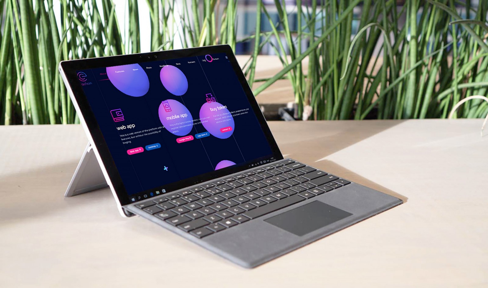
Прогуляйтесь по проектам gqjapan, magicleap, gucci, kinsta, erachain, acnc, sproutsend, rbuilddev. Во многих вариантах градиенты использовались весьма сложные, хотя, на первый взгляд, кажется, что тонировка создана обычной: от темного к светлому. Если смотреть чуть дольше, можно увидеть в середине еще дополнительные цвета. Они то как раз и помогают связать два противоположных цвета на колесе. А сами сочетания знакомы и обыденны, даже зачастую осмысленные. Синий цвет для медицины, благотворительности – естественен, как и добавление зеленого – символа жизни и роста. В сочетании друг с другом они дают смысловую нагрузку и великолепное смешивание.


Что дальше?
Градиенты в веб-дизайне в любое время и при любых трендах являются отличным и легким способом модернизировать и разнообразить проект. Порой даже при редизайне можно оставить и цвета, что были, и прочее, но вместо «жестких» заливок использовать смесь тонов. И это несложно создать:


Завершение
Плоские цвета доминировали в веб-дизайне в последнем десятилетии, но сейчас (последняя пара лет) ситуация меняется в связи с появлением градиентных цветовых схем. Причина проста – градиенты дают брендам возможность выражать свои мысли более свободно, делая тонкие переходы между парами основных цветов.
Сайт является первым, что пользователи видят, когда планируют изучить информацию об определенной компании. В таких условиях чрезвычайно важно создать «свой» сайт (уникальный или приближенный к такому) и правильно использовать красивые цветовые схемы. Градиенты играют важную роль в этом отношении, потому что они позволяют дизайнерам придумать более привлекательные решения, которые вдохновляют посетителя оставаться на страницах немного дольше.
Когда-то придет время и градиенты станут менее привлекательны, они уступят место чему-то новому. Но сейчас – это действительно современный тренд, который не собирается «уходить со сцены», поскольку даже обычная тонировка или небольшой переход от темного к светлому уже сами по себе являются градиентами. Но кто сказал, что кроме черного и белого нет больше цветов, не существует режима прозрачности для слоев, процентовки заливки?
После длительного периода однотонной цветовой конструкции градиенты появляются, как естественный выбор дизайнеров, потому что предлагают разнообразие стилей и импровизаций. Они вводят еще одно измерение и приносят столь необходимую глубину, которая становится якорем современного веб-дизайна.