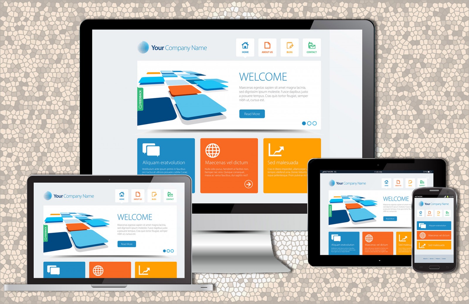
Использование мобильных устройств для доступа в интернет и веб-серфинга становится все популярнее. Как следствие этого, все большее число пользователей желает видеть мобильные версии сайтов: удобные и красивые одновременно. Но, как бы странно это не прозвучало, до сих пор многие сайты (почти половина, чего уж скрывать) не оптимизированы для корректного отображения на мобильных устройствах. Но реально ли нужно адаптировать сайты? Почему многие говорят не об адаптированности, а отзывчивости? Сегодня мы уделим данному вопросу наше внимание и посмотрим на некоторые бесплатные ресурсы, что позволяют протестировать ваш сайт/дизайн и узнать, что же еще в нем нужно и можно доработать.
Не секрет, что для 100% эффективности дизайна сайта необходимо, чтобы на каждом мобильном устройстве, настольном компьютере или консоли (браузер и там есть) он выглядел и работал одинаково. При этом нужно еще учитывать и специфические дизайны устройств от Blackberry, iPhone, IPad с учетом их экранов и размеров.
Отзывчивость и адаптивность
Впервые об отзывчивом дизайне написал Итан Маркотт в статье для журнала A List Apart. RWD (Responsive Web Design) предполагает изменение макета сайта, исходя из размеров экрана устройства, на котором он отображается. Именно поэтому можно видеть сайты, которые выглядят одноколоночными на смартфоне и трехколоночными на PC. Отзывчивый дизайн автоматически адаптируется под разные браузеры, размеры экрана, операционные системы, аппаратные возможности. При этом все изображения, графика, текст, секции и блоки автоматически изменяют свои размеры и предлагают, тем самым, пользователям лучший опыт взаимодействия, удобство и приятный взору продукт.
Помимо же RWD существует, так называемый, адаптивный веб-дизайн или AWD (Adaptive web design). В отличие от RWD, в AWD для каждого устройства создается свой макет сайта. Соответственно, полностью эффективным и рабочим такой сайт быть не может. Да и разработка AWD занимает и времени больше, и инвестиций. В процессе работы с таким сайтом во время его загрузки пользователем в браузере, сервер начинает проверять устройство, искать подходящий макет по размерам и затем только загружать.
С течением времени эти два понятия стали расширяться, дополняться и теперь попросту (если коротко и лаконично) смысл проектирования стал сводиться к тому, чтобы создавать отзывчивые сайты, способные автоматически адаптироваться под любое разрешения экрана и обладать при этом только одной версией на сервере. Если же заказчику требуется сайт только, например, для устройств Apple, то отдельно обговариваются серии продуктов и нужные размеры.
Практика создания эффективности
Теория это одно. На практике, порой, все получается совсем иначе. И чтобы создать по настоящему отзывчивый сайт требуется проверить его на максимальном (почти всех) количестве устройств, что существуют сейчас или появятся в скором времени (ведь их размеры и разрешения известны всем заранее). Разумеется, что такого количества бюджета у большинства из вас нет, да и никто не предоставит такого объема физических устройств для тестов в реальном времени. Но существуют интернет-ресурсы, которые предлагают это сделать быстро. И не просто проверить макет на гипотетических экранах, а выбрать мобильные устройства из огромного списка.
Если посмотреть на сайты, что появляются ежедневно в интернете, почти все они имеют стандарты и тренды современности, различные украшательства и даже порой кажется, что все они созданы только для РС и на мобильных устройствах работать не будут. Развеем сомнения!
XRespond
Приложение Xrespond именует себя как «Лаборатория виртуального устройства». Благодаря данному сайту можно увидеть, как любой иной сайт в интернете выглядит на различных устройствах. Работает XRespond в горизонтальном длинном стиле, поэтому чтобы увидеть все макеты полностью придется прокрутить страницу. На ярлычке над каждым макетом пишется точный размер и соответствующее мобильное устройство. А выбрать есть из чего. Здесь и смартфоны, планшетные РС, ноутбуки, настольные решения. Если нужного вам разрешения нет, можно настроить свое и посмотреть, как сайт будет выглядеть.
Мы взяли пример Core 3 Technologies – сайт дистрибьютора продукции для IT-сетей. На РС сайт выглядит очень красиво, с эффектом подгрузки, параллакса и многого иного. Как оказалось, на мобильных устройствах аналогично.


И как пример, интернет-магазин Лэтуаль наоборот, совершенно не отзывчив к разным разрешениям экранов.

Responsinator
Еще одно приложение, которым можно наслаждаться - Responsinator. Чтобы не использовать горизонтальную прокрутку, этот сайт предлагает одну вертикальную. Просто листайте вниз и увидите отзывчивость вашего сайта.
Из устройств представлены макеты наиболее распространённых моделей iPhone и Android Nexus с портретной и альбомной ориентацией. Есть и варианты iPad. Но еще одной особенностью данного сайта является возможность переключения между http и https. Иными словами, Responsinator предлагает просмотр сайта в двух вариантах в зависимости от того, какой адрес вы вводите.
Посмотрим, как выглядит сайт конференции веб-дизайнеров и разработчиков Mirror Conf и интернет-магазин Tina


Responsive Design Checker
Если требуется очень быстро проверить отзывчивость дизайна сайта, то помочь может ресурс Responsive Design Checker. Он создан специально для основных пользовательских размеров экранов устройств. Более того, когда вы введете адрес сайта и увидите его прогруженную модель, то получаете полный контроль над ним. Можно менять ширину/высоту, использовать инструмент соотношения сторон. В левой панели выбрать одно из трех устройств и его вариаций. При этом в данных списках можно найти новые модели смартфонов и планшетов, даже тех, которых не было в предыдущих вариантах, например, Google Pixel.
И да, поддерживаются макеты настольных мониторов с диагональю в 24 дюйма. Но и у вас на экране они будут отображаться в полный размер, поскольку панель предварительного просмотра изменяет размер на основе соотношения, а не по ширине полного пикселя. Поэтому, если вы сейчас смотрите материал на планшете и вам хочется проверить отзывчивость макета при ширине 1920 px, то вполне можете это сделать. Ресурс стоит того, чтобы находиться в закладках!


Мобильный тест Google
Google не остается в стороне и обладает огромным количеством инструментария для веб-мастеров. Mobile-Friendly Test как раз и является одним из таковых. В действительности данный инструмент не просмотрщик и он не поможет вам определить ошибки UI. Но он способен определить проблемы в пределах вашего сайта и его отображения на мобильных устройствах.
Тест можно пройти или нет и узнать, дружит ли ваш сайт с экранами мобильных устройств. Для дизайнеров это слишком общая информация, но дополнительно Google дает некоторые советы и описывает имеющиеся проблемы, а также элементы, которые могут решить возникшие неурядицы.
Да, это не ресурс тестирования отзывчивости к разным устройствам, но место, где можно узнать адаптирован ли сайт для мобильников или нет. Тем более, что анализирует и дает советы такая авторитетная компания в интернете как Google.


Am I Responsive
Если вы ищите инструменты проверки отзывчивости дизайна макета с пиксельной точностью, то проект Am I Responsive навряд ли вам понравится. Но и у него есть положительные и интересные моменты.
Достаточно просто ввести адрес сайта, а затем увидеть, как он отобразится на четырех разных устройствах: смартфон, планшет, ноутбук и РС. Но это не в масштабируемом виде, поэтому выглядит очень «образно».
Но это действительно здорово, например, при создании скриншотов для последующей демонстрации заказчику того, как будет выглядеть сайт в будущем на разных типах устройств. Затем можно провести рендеринг с точностью до масштаба, если позволяет размер вашего экрана и окна браузера.
Кроме этого, данный ресурс способен работать с адресами localhost, поэтому даже если у вас нет загруженного варианта сайта в интернете, то можно ввести локальный адрес на компьютере.


Designmodo Responsive Test
Еще один инструмент, который мы бы действительно рекомендовали полюбить. Это Designmodo Responsive Test от одноименного проекта. Как и предыдущие инструменты, он позволяет увидеть, как дизайн вашего сайта будет выглядеть в браузере на том или ином разрешении экрана, основываясь на определенной ширине.
Но есть одна особенность у этого проекта, без которой, возможно, он и не привлек бы к себе особого внимания в среде веб-дизайнеров. Речь идет о настройке сетки. Иными словами, вы можете проверить, как выглядит страница на пиксельной сетке или адаптировать ее в своих проектах.
Более того, можно перемещать панель предварительного просмотра и, тем самым, подбирать нужную вам ширину экрана или окна браузера, для которых тестируется макет. Если вы знаете точную ширину/высоту, то можно ввести и их.
И, да, значки в верхнем правом углу позволяют выбрать и готовые пресеты размеров экрана различных устройств и снова изучить ваш макет.


Браузер
Мы назвали этот инструмент так, поскольку на сегодняшний день он существует и в Google Chrome, и в Opera, и в Yandex браузере и иных. Хотя изначально создали его именно Google.
Инструментарий позволяет имитировать размер экрана мобильного устройства и увидеть в результате, как будет выглядеть ваш сайт. При этом поддерживаются даже устройства Apple и Microsoft, а не только решения Google Nexus.
Чтобы активировать инструментарий откройте сайт и нажмите Ctrl+ Shift+ M, чтобы перейти в режим разработчика и отладки кода. Или это также называется Просмотреть код элемента. Затем в панели справа в верхнем левом углу найдется значок двух экранов. В результате можно выбрать готовые устройства или ввести свои показатели ширины/высоты экрана.


Выводы
Разумеется, что существует еще огромное количество различных приложений и сервисов, которые позволяют по-разному оценить эффективность вашего дизайн-макета на разных устройствах. Есть даже платные браузеры, например CrossBrowserTesting, Browser Stack, Ghostlab и прочие. Наша цель была познакомить или напомнить тем, кто пользуется ими часто, с бесплатными возможностями и ресурсами.
Можно тестировать макеты и непосредственно в Photoshop во время их создания. Но зачастую это неудобно или неэффективно, поскольку сайт и без того создается и для РС, и для мобильных устройств. Мы не уделяли сегодня времени идеям и вдохновению, но иногда нужно обращать внимание и на такие вот технические стороны, которые тоже способны вдохновить веб-дизайнера на новые решения. Как и чем? Улучшение уже имеющегося. Представьте, если вы заметили неполадку в дизайне, на которую обычно и не обратили бы внимания, а она выскользнула только при отображении на экране крошечного телефона. Бывает и такое.