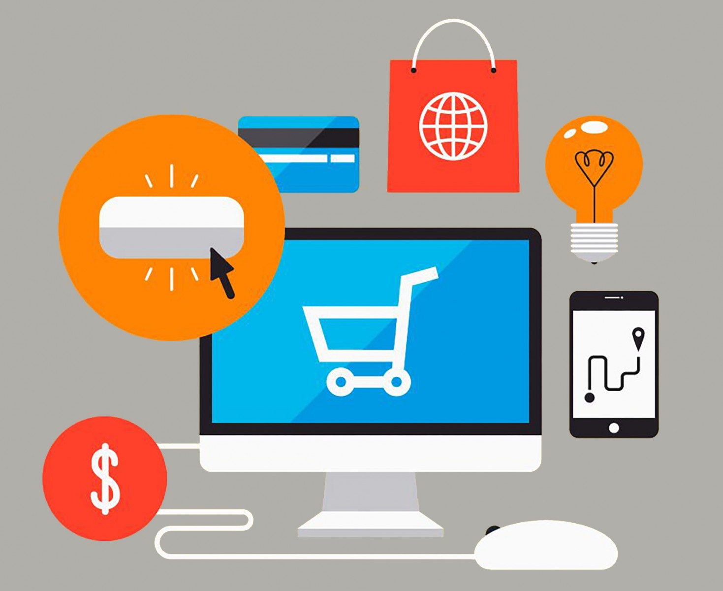
How often do you visit online stores? Probably at least once every week or two. Maybe you need to buy or replace a computer mouse, or your favorite face cream just ran out at nearby stores — and only that one works for you! Life is full of such little needs. But even so, we tend to shop at the same online stores, only occasionally exploring new ones. Why? One major reason is usability (not just product availability or brand awareness). So, what makes a store convenient? Why are seemingly similar e-commerce websites so different in terms of traffic?
The world of modern e-commerce is changing rapidly — much faster than corporate websites or news portals. This presents a challenge for any web designer: to create a user-friendly experience while staying current with e-commerce trends and choosing only what is truly necessary for a particular type of site.
So, what exactly matters now when designing an e-commerce website? What are clients and developers paying attention to? Let’s go over some major trends, look at international e-commerce practices, and touch on some creative examples.
Mysterious Menu
The “hamburger” menu — layered, hidden, with subcategories — is gaining popularity, especially for helping e-commerce sites reduce clutter. Interestingly, this type of menu is mainly used in mobile apps or mobile versions of websites. On desktop, it’s less common, though there are variations. For example, Chinese online stores like Taobao, Banggood, and Gearbest use clear, sidebar menus — sometimes supplemented with floating panels for additional categories. We’ve written about this separately. Elsewhere, menus can be presented as products themselves, like on Martina Sperl, or in a minimalist form like on Evyi Shop. The Bill Blass project is also interesting, and we’ll return to it later.


One for All
A unified design for viewing on desktops, tablets, and smartphones is a requirement in 90% of cases. However, responsive design is no easy task — screen sizes keep changing. Users now view websites on large desktop monitors, TVs, various smartphones and tablets, all with different resolutions. And the site must not just look consistent but feel intuitive and user-friendly on all of them. That’s why designers increasingly build for large screens first, then create a mobile app, a mobile site version, or opt for fully responsive design.


Material Design
Material Design remains popular since 2014. Bright and clean, it’s ideal for both desktop and mobile sites as well as apps. But using Material Design in e-commerce is tricky — usually, only parts of it are adopted. Very few companies base their entire site on this style. Some examples include the French home goods store Pa Design, India’s Bewakoof, the international Wildberries, and Spain’s HOMMU. Some use a full-fledged version; others borrow only the basics. It’s best to see these sites live to understand the approach.


In Motion
Animation has a magical ability not only to add flair to any site, but also to create emotional appeal, build trust, and improve usability. Of course, too many moving elements can overwhelm visitors — flashing text and spinning images are off-putting.
Pioneers are now using animation on "Add to Cart" buttons, wishlist icons, product controls (rotate, zoom), and loading bars. Check out creative uses of animation on the U.S. sports store Fleet Feet Sports, where tiles feature hover effects; the art store affranchi.myshopify.com, where tiles slightly shake and change shade; or Good As Gold, where the animated logo turns into a loading circle between page transitions.


Sometimes, instead of a static product image, sites include a product video — like Wildberries does.
Photos and Videos on Display
Large, focused photos have their own charm and are excellent at capturing the attention of buyers and potential clients. Imagine a bag or backpack store, where the homepage features photos of real people using the products in various situations, cities, or environments around the world. This improves perception and helps users choose the right product more easily. Nearly all large retailers incorporate some level of photographic styling.
Typically, photos are used on the main page (storefront), but they’re often added to category or product pages as well. In some cases, photos are replaced with videos. Examples include eyeheartworld.org, helmboots.com, rebel8.com, and puma.com.


Alternative Browsing
An unconventional but convenient search format is growing in popularity. It doesn’t replace the standard search bar at the top of the site — rather, it complements it with horizontal scrolling in product categories. This is useful when there are many items to browse, allowing users to quickly skim through inventory. Good examples include Ozon, Jadopado, and Tea Place.


Also worth noting — bold, vivid color palettes are becoming more fashionable than pale, washed-out ones. Use Pantone research as a reference to highlight important UI elements with stronger color accents.
Author-Driven E-Commerce Sites
Trends and standards are great — they’ve proven effective, users are familiar with them, and they often ensure good performance. But when companies create and sell unique, original products, they want their e-commerce websites to reflect that individuality. Not just visually, but in terms of usability too. Well-known brands are also pursuing this approach with great enthusiasm.
NORTHERNISM
A minimalist online store with a grid layout, beautiful typography, and asymmetry — very different from template-based e-commerce sites. Each product page includes detailed descriptions and several clean images that showcase the item clearly. The standout feature of this project is the use of lifestyle photography — not just white-background product shots, but real-life scenarios showing products in homes, gardens, offices, and living spaces.

Bill Blass
This fashion retailer avoids traditional product grids on the storefront. Instead, items are laid out “on the table” in an organic visual arrangement. All clothing is matched by color, size, style, and vibe. Shoes go with dresses, shirts with slip-ons — not random items. And yes, each product features a hover description with name and price. The site menu is minimal — placed at the top and bottom — and differs slightly in each position.

Drybar
A rich color palette and polished animation give this e-commerce site uniqueness, charm, and elegance. For example, when you hover over a box in the menu, it jumps; hover over a hair dryer, and it bobs up and down. This animated interaction appears throughout the site — yet it never becomes annoying. Product cards also feature hover hints. The site's design stands out due to animation in almost every element — even tab titles glow. This enhances user experience and evokes positive emotions.

In Conclusion
So, we’ve showcased vibrant, real-world examples of what modern online stores can look like and where global companies are heading. As consumers, we want to spend our hard-earned money wisely — and that means choosing stores where we feel comfortable, safe, and understood. Whether you’re considering a redesign or a brand-new site, it's important to follow key trends — but that doesn’t mean tearing everything down and starting over. Design is always about conversion and performance.
And yes, it may sound cliché, but Steve Jobs once said:
"Design is not just what it looks like and feels like. Design is how it works."
And that rule applies not only to physical products, but to web design — especially e-commerce websites.