The winds have carried 2017 into the past, which means now is a great time to reflect on its achievements and consider what lies ahead for us and for web design. In a previous article, we already began exploring the technologies and accomplishments of the past year that will remain relevant in the current one. But at that time, we left out newer constructions, updates, and even simple design tricks that align with various styles and directions. These, however, will gradually gain popularity throughout this year. Moreover, some of these trends will be widely used not only in website creation but also in print design and logo development.
Asymmetry
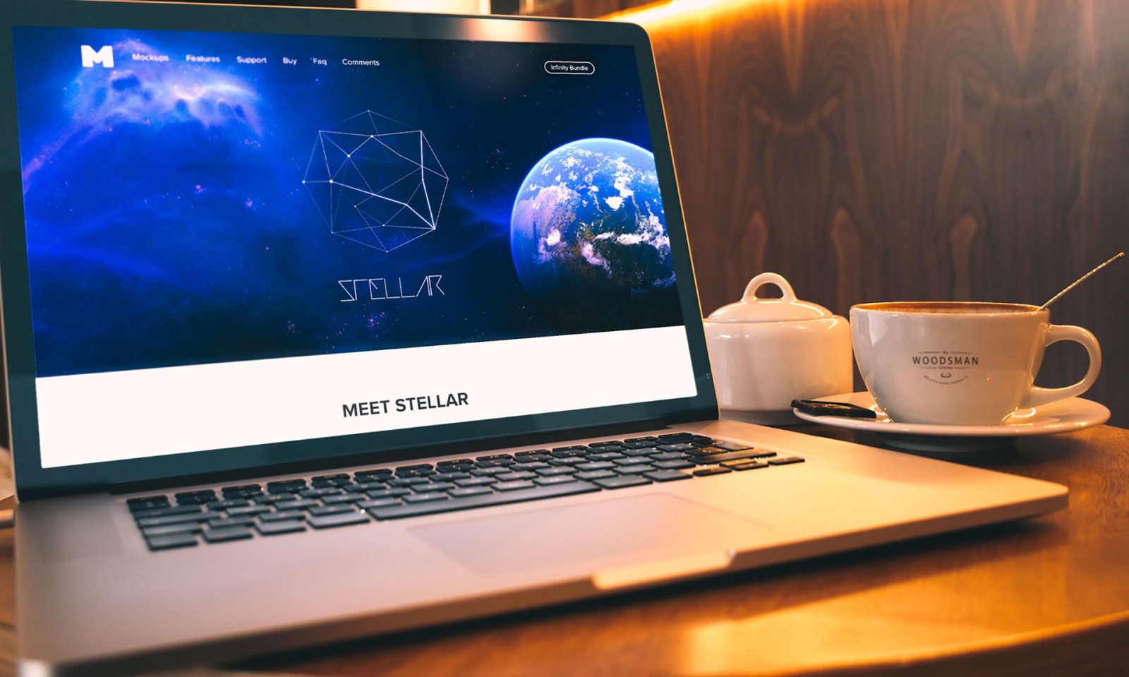
The era of perfect symmetry is nearly over. While split-screen layouts were trendy in 2017, the concept has evolved — now the separation is becoming more chaotic and asymmetrical. To design and balance such a layout requires finding the right harmony of elements so that one side doesn’t overpower the other. Often, space-themed visuals combined with text and layered photo filters are used to attract user attention.
Surprisingly, even this asymmetry still relies on a modular grid. And the reason is simple — organized structure. Take a look at examples like dada-data, veintidosgrados, beoplay, clubofthewaves — you’ll notice how asymmetrically placed elements are arranged in a way that looks clear, balanced, and fresh.


Brightness
It seems that vibrant color is a trend that wants to stay in people’s minds and hearts for a long time. Yes, it’s a key part of flat design and equally important for Material Design — both styles still influence many projects.
Even outside of those specific design approaches, bold and bright colors are eye-catching and help attract visitors to a website. These hues have a fresh, unique look and resonate well with younger audiences.
In fact, let’s go further: rich and loud color palettes can create a surprising aesthetic and striking atmosphere for websites or brands that were previously unknown or unremarkable. The following examples — scaleapi, spotify, egwineco, funemployed, makeitdriveable — clearly show how drastically our perception of a company can shift, challenging our initial assumptions.


Bottom Pop-Ups
All those tiny notices at the bottom of mobile apps and websites are now transitioning to desktop and tablet designs. And it’s not just about ads — we’re talking about chat windows, pop-up alerts, and navigation prompts.
The bottom of the screen (not the page) is one of the most non-intrusive areas, and also the primary zone for user interaction. Mobile devices have trained users to expect ads or additional info at the bottom.
And, amazingly, it works! Bottom-screen announcements — like those used by Burlap and Blue or our own WAYUP — may seem unobtrusive, but they’re effective. The user still sees the content and can dismiss it if they want.

Voice Control
A rather extraordinary topic — we’ll definitely cover it more in the future. But what’s interesting right now…
The future of web design isn’t 100% visual. Some designs can be heard — they have a voice. This refers to interfaces capable of hearing and interpreting voice commands, especially for search functionality and beyond. Interacting with them simulates natural human conversation, merging global voices with the programming languages used in web design. We’re already familiar with voice assistants like Alice (Yandex), Cortana (Microsoft), Siri (Apple), and Google Assistant (not widely used in Russia). Now imagine managing a website through voice commands. That’s where the future is heading, supported by the rapid development of mobile tech and smart home systems — which already exist, even from providers like MGTS.

Yes, such trends likely won’t gain massive popularity during 2018, but voice recognition and related technologies will continue to evolve and be used more frequently. However, it’s wise to start planning such projects now, so that in the future, integrating voice features into existing websites and interfaces will be much easier and faster.

Fluid Shapes
While 2017 focused heavily on geometric forms and sharp angles, 2018 brings in fluid or soft, wavy shapes — often referred to as “soft” lines.
Smooth lines are a natural continuation of the polygon trend. They don’t replace it entirely — geometric shapes are a timeless classic — but they complement and refine it. We previously noted that one advantage of polygons is that they allow each project to be unique, whether flat, volumetric, or animated.
The same can be said for fluid shapes. The main difference is that instead of sharp intersections, users see smooth, flowing curves that visually “move” across the screen.
Take a look at bubblewits, elje, clearbit, algolia — you’ll immediately see how such forms dramatically shift the visual perception of layout and structure.


SVG Graphics Format
Scalable Vector Graphics (SVG) are being used more and more by web designers as the default image format for websites. SVG is a lightweight vector format ideal for icons, logos, and charts. Each pixel in this format remains perfect and independent of screen resolution or size. In short, the quality stays crisp even when scaled.
With high-resolution displays becoming more widespread and accessible to users around the world, SVG is growing in popularity.
We probably wouldn’t pay it much attention if not for its support of multimedia content. This includes 3D, cinemagraphs, animated logos, panoramic and 360° 0 images.
There are no specific examples here — only the knowledge and experience to use the format to its full potential.
Split-Screen Layouts
Split-screen design patterns continue to grow in popularity, regardless of whether they are symmetrical or asymmetrical. The number of split styles has exploded. These layouts became so popular for one key reason — they provide a great user experience on both desktops and mobile devices by displaying dual content side by side. The way elements are paired works equally well across platforms. Of course, variations exist depending on the device and the goals of a specific project.
A useful trick in such layouts is not just the split itself, but also overlaying a top layer — with text or a logo — to create a sense of depth and layering. We touched on this in a previous article. Also check out galaxii game app, android, simonleegallery, getbaseui.


Scroll Animation
Parallax or scroll-based animation has been so popular (and still is to some extent) that, ironically, web designers are beginning to phase it out. But that doesn't mean scroll animations are going away completely.
Beyond parallax, there are countless creative ways to encourage users to scroll. Using a small amount of parallax is still acceptable — even recommended. The key is not to overdo it or overwhelm the user.
The project doggoforhire is a great example of scroll-based animation. As you scroll with your mouse wheel, confetti and geometric shapes fall behind a dog character. The faster you scroll, the faster the confetti falls. The dog’s expression even changes depending on scroll speed. Scroll quickly — and it looks like a video; scroll slowly — and text content appears on the left side of the screen.

Here are a few more projects offering creative scroll animations: smartusa (you can rotate the car 360°), loveinstantlove, imsproductions, sliders.


White Space, but Not Minimalism
Designers love white space, and they also love minimalism — even if our clients often don’t. Most of you would agree: a compromise is needed. One that allows plenty of white space, but minimalism in its lightest form. But how?
Through color, thoughtful design elements, and generous spacing. Visually, the elements will appear spaced far apart, yet the layout will still feel cohesive and structured.
Design Calendar did an excellent job using both space and content, with a variety of large, well-placed elements. Be sure to scroll the page to see the interface and overall layout in action. The oversized elements feel right at home — surprising and bold, yet balanced.

Designers now work with white space and background more frequently — and in different ways. Look back at our past articles and see how many examples we gave. But also consider this: 2018 should bring something new and rethink the old.
Also check out culture, nurturedigital, aventura, kasradesign, programatorio.


Conclusion
Does all of this mean the start of the year will inspire us to try something new? Maybe it’ll spark your own personal design revolution?
We haven’t covered every trend that may appear and evolve this year — there’s enough for another article.
Either way, remember: applying any web design trend requires caution. Even the best ideas can rise fast and fade instantly. But there are timeless trends — ones that are always relevant and welcomed. That said, when it comes to voice interfaces and assistants, it may still be a bit early for mass adoption. Most people aren't quite used to them and still see them not as "useful innovations," but as “some high-tech, complicated, flashy thing — I’d prefer something simpler, more modest, and cheaper.”
Still, since growing your skills in design is impossible without practice — experiment, iterate, and enjoy the process. Create for yourself, your friends, your community. Play with trends like they’re colors on a palette. Maybe you won’t find something entirely new, but you just might discover something unique and original.