Ultraviolet. Sounds like the name of a band or a movie. It evokes something unconventional and informal. Yet this very color was chosen by Pantone as the Color of the Year 2018, explaining that they were inspired by art and music—by the individuality hidden in color.
Last year, we covered in detail Pantone palettes, the Color of the Year 2017 (a light green), and many related topics. To avoid repetition, let’s just note: you don’t need to rush to redesign all your websites using ultraviolet. Pantone defines the leading and dominant color—a color that’s not necessarily used on its own but included in suggested palettes, which can complement brand colors, logos, etc.
The color resembles the famous purple of Prince —used in posters, stage designs, lighting effects, videos, fashion. But only resembles it, as the tone is different. Let’s take a closer look at how ultraviolet can be used in projects—and how web designers around the world are already doing it.

Ultraviolet: The Basics
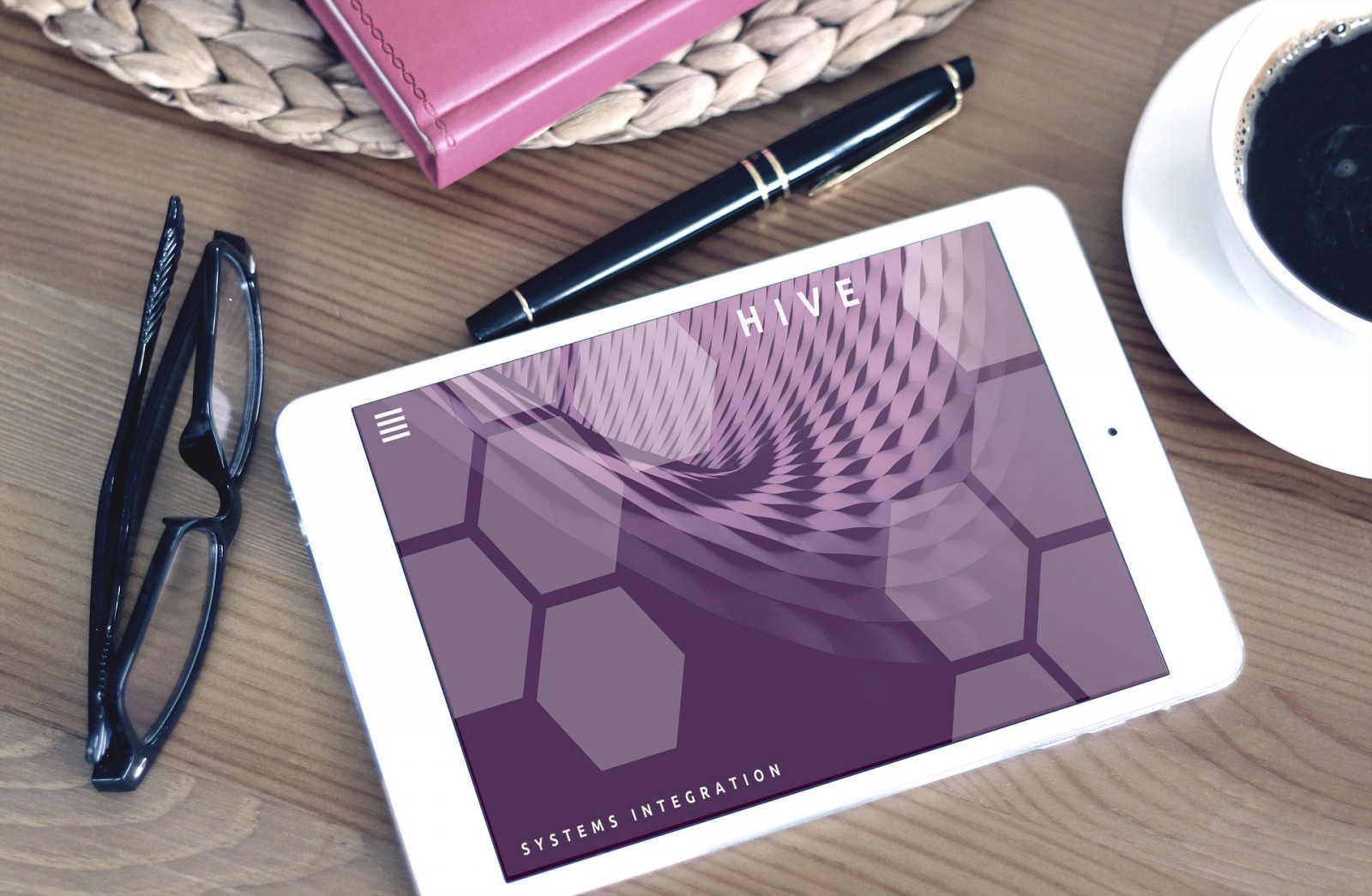
Pantone’s Color of the Year, Ultraviolet, is labeled 18-3838. It’s a rich, deep purple—pure and saturated—capable of stirring emotion and sparking creativity. Designers, unsurprisingly, love this kind of energy.


Pantone Color Institute’s Executive Director Leatrice Eiseman explained the idea behind the choice as an opportunity to imagine and invent. “ We live in a time when creativity and imagination are essential. These are the types of inspiration that led us to choose Pantone 18-3838 Ultraviolet—a blue-based purple that elevates our awareness and potential. From exploring new technologies and the galaxy to artistic expression and spiritual reflection, intuitive Ultraviolet lights the way forward.”
While these words may sound lofty, they perfectly reflect the intent behind the color trend for 2018 and show what ultraviolet can do. It’s not an easy color to use—it’s rarely seen in design due to its complexity and difficulty to match with other shades. But when combined with brighter, dominant tones popular this year, it can transform the visual side of websites and digital projects.
Technical Color Info

Pantone: 18-3838 or 2096 C
CMYK: 76 C, 75 M, 0 Y, 0 K
RGB: 101 R, 78 G, 163 B
HEX: #654EA3
Besides color values, Pantone also prepared a set of ready-made palettes that include Ultraviolet and pair well with it. These palettes are compatible with Adobe products and can be downloaded here. The archive includes palettes such as Floral Fantasies (Ultraviolet with soft pastels), Desert Sun (with brick and bold oranges), Tranquility (coffee and brown tones), Misty (gray, greenish, brown pastels), and other inversions.

Note: .ASE files from the archive can be opened via the Swatches panel in Photoshop. You can load them one by one or drag them directly from your file browser into the panel. Either way, they’ll appear in the application and be ready to use.


The Meaning of Ultraviolet
Purple as a color carries deep associations. It’s not commonly found in nature but frequently appears in design palettes. It’s majestic, mystical, and significant. Scientifically, purple lies at the edge of the visible spectrum—high in energy, low in wavelength. It’s heavy to perceive, cold, dark, but also rich and calming.

Diving into color theory—just as crucial for a web designer as general knowledge—reveals some key nuances.


That’s in everyday life. In design, things differ: purple isn’t always perceived as friendly or comfortable. In fact, many people both love and hate it at the same time. Few are indifferent. So always consider your audience—will they accept Ultraviolet? Will they resonate with it?
Pantone sees this love-hate relationship as historical: “ Mysterious purples and violet tones have long symbolized counterculture, nonconformity, and artistic brilliance. Ultraviolet Pantone 18-3838 is unique, emotional, saturated, and symbolizes experimentation and individuality. It encourages people to present their own voice and break free from tradition and routine through expression.”
Using Ultraviolet in Web Design & Print
This year is shaping up to be complex and unconventional, from typography to color palettes—especially in web design. We discussed the quirky nature of typography in a previous article. But when analyzing color palettes, we realize there’s something even more extraordinary. With 16 million colors and shades to choose from, designers face a massive spectrum—each color unique in its application.
Purple is exactly that kind of special color. You can’t just use it arbitrarily and expect users to like it. Ultraviolet must be used with intent and strategy. The good news is: there are countless ways to do this—and that’s why we look at the work of talented webmasters.
MIA Web Lab used violet to separate sections and tone images. With gray background pages, the violet hue helps animated text stand out. Ultraviolet allows users to grasp the whole message instantly.

Ultraviolet works great in gradients and split-screen layouts. When it fades into another color, the harshness softens, making it more palatable. A good example is interface-design.

The mystery and drama of ultraviolet shine in monopo—a non-fantasy project that still feels creative and engaging. Complex, multi-colored gradients blend like brushstrokes. Here, purple represents creativity in Tokyo, seen both in videos and photo styling.


Ultraviolet isn’t natural by itself, but we see its many shades in real life—in photos and visuals. Designers at hideoutlodge used lighter ultraviolet tones to tint images, videos, and text. They paired it with warm coffee-brown hues. Rather than altering every image's palette, they added character and realism. The result feels wintry—not icy blue, but warmer and more inviting, even though purple is naturally cold.


Simplicity, minimalism, and the contrast of black and white. In this design, color is used only for accents. giuseppespota applies a violet-blue gradient to button outlines and headers—nothing more. It’s a subtle way to draw users in without overwhelming them.


Ultraviolet is ideal where contrast is needed—especially when it's not part of the site’s base palette. For example, at dolsolcitrus, if oranges were shown only against the sky, there’d be no strong contrast. But when hovering over them, the violet background changes to light green—making them pop. Black would feel gloomy, and red, ruby, or blue wouldn’t have the same effect.


Web designers go beyond gradients and bright blends. Other creative uses include pastel illustrations at aproposducancer, quiet multicolor at gabrielesurdo, businesslike simplicity at antoinettetuff, and also dylandeheer, grupoanjos, bellina-alimentari, btlnet.


While pure Ultraviolet isn’t used frequently in site design, the results are always visually appealing. This complex color doesn’t discourage exploration. On the contrary—it proves what Pantone said: Ultraviolet is a color of dreams, imagination, discovery, and deep creativity.
Conclusion
So what can we conclude? It’s great that Pantone chose Ultraviolet—a deep and bold tone—as the Color of the Year. Many people adore purples, but they’re hard to work with. Whether it’s fabric, eyeshadow, photo tinting, or borders—it’s tricky. Imagine losing contrast or clarity because of poor pairing. Yes, you can use ultraviolet shades—but that’s where the challenge begins.
Still, Pantone is clearly trying to help designers unlock ways to use purple creatively. Not everyone knows how to pair it. That’s why they prepared eight palettes—to spark ideas. From there, it’s up to your imagination.
One thing is certain: however a designer chooses to implement Ultraviolet, it will affect users emotionally, set a mood, and add creativity—without complex graphics. A single color can transform a whole project. That’s both stunning and powerful.