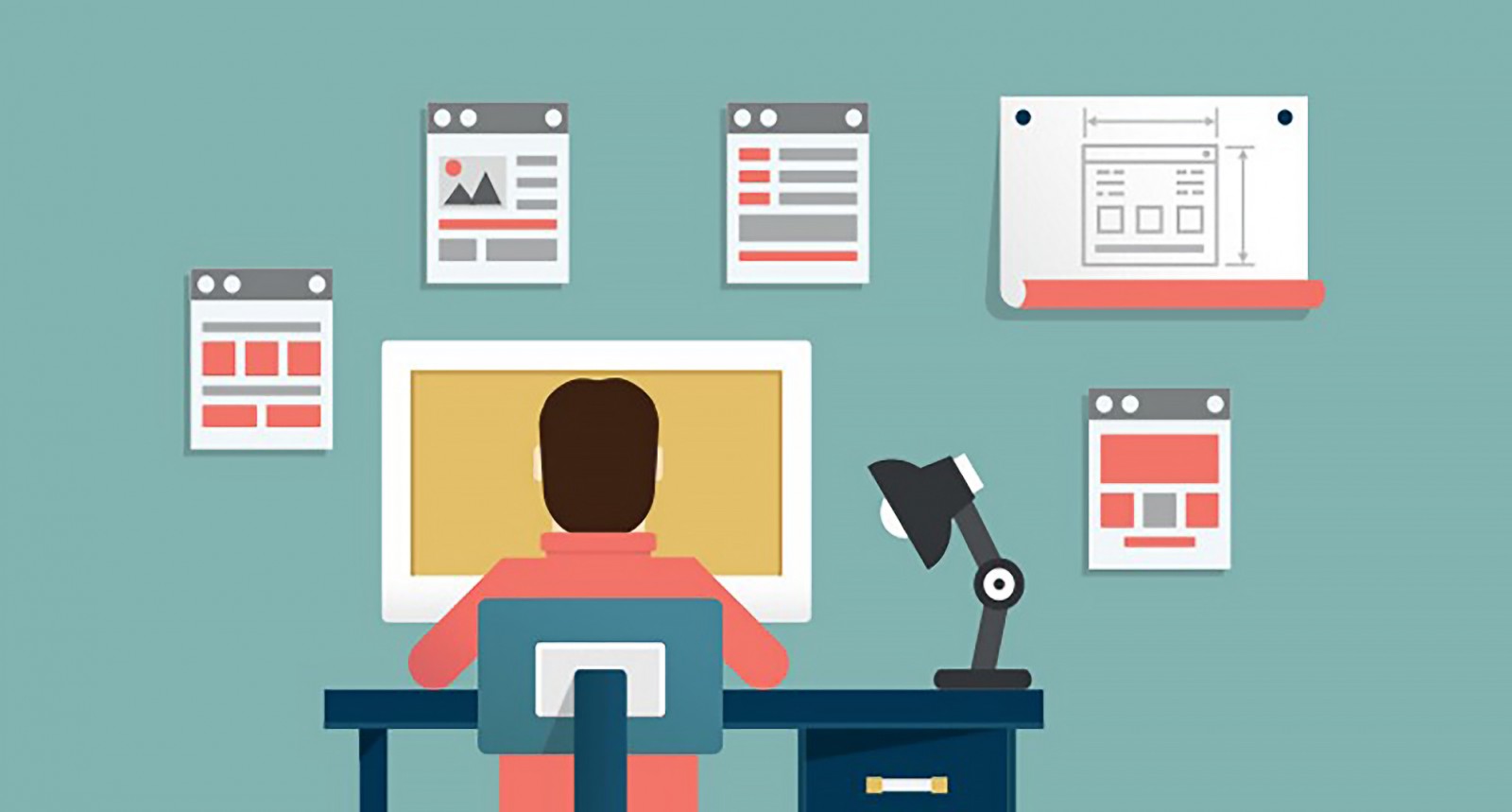
How deep is the concept of web design? What matters when creating a landing page, an online store, a blog, or a corporate website? Undoubtedly, appearance and informativeness. But at the same time, marketers and users themselves often emphasize that it's equally important for a web designer to consider whether the site will be convenient for visitors. Web design or redesign is much more than just graphic design in the traditional sense: color, shapes, sizes. Sometimes, getting carried away with placing and designing buttons or information blocks, one can forget whether all these elements are appropriate or placed where users expect them.
Nearly 88% of internet users claim that if a website doesn't appeal to them at first glance or they don’t understand something, they almost never return. That's why website design today is largely based on user experience — commonly referred to as User Experience Design or simply UX.
UX in a Nutshell
User Experience Design isn’t design in the visual sense we’re used to. It’s the design of user interaction and behavior on a website as a whole, across its pages. What should the user see or read, what are the possible next clicks, and what info comes after (very roughly speaking). A user already has a set of expectations based on previous experiences with similar sites, and when visiting a new one, they expect familiarity and intuitiveness. Websites like NVidia and Microsoft are great examples. The issue isn’t that their templates look alike, but that the information is well structured and conveniently placed — it's expected that news and highlights are on the homepage.


Thus, using user experience in web design means taking into account graphics and photos, creating clear and intuitive navigation, and planning how information and content are presented on site pages. And yes, even though user experience seems obvious to everyone, web design sometimes turns out to be poorly executed, and site traffic doesn’t increase — even with great content. That often happens because navigation that seems logical to the designer remains confusing to the user.
UX design matters not only to the web developer — the client also talks about it when determining what the website should accomplish. And of course, UX plays a major role during redesign. We’ll explore the key aspects of user experience and how it’s implemented on different websites — including what not to do.
Visual Hierarchy
The purpose of visual hierarchy is to clearly communicate what the website is about, how to use it, and why it’s useful — all within the first 2–4 seconds of a visit.
Defringe
A blog about creative achievements around the world: articles, photos, and stories. The top menu instantly tells you what the site is about, lets you explore categories, and search. Everything is right there — clear and intuitive.

HARRY'S
This German brand sells men’s shaving products and razors, along with a tech division. The site is primarily an online store, and secondarily about the company itself. That’s why articles, news, and FAQs are at the bottom, while product info and ordering options are placed at the top.

Focus on What Matters
Sometimes websites have a large amount of content that simply has to be there. But that doesn’t mean you should dump all the text onto the homepage in hopes visitors will read it all. We’ve already discussed the importance of whitespace in web design — and that’s exactly what matters here.
Invisionapp
This company briefly and clearly presents its product (collaborative design and site prototyping). They’ve moved some details to separate pages and left the essential info on the homepage.


Apple
Apple also introduces its new products in brief, while moving all the detailed specs (design, graphics, performance, etc.) to separate dedicated pages. This way, users can easily see where each product is, and explore details if they’re interested.

Clear Navigation
In the past, many sites had a small, neat "sitemap" link. Today, you rarely see it — except on sites with complex design or tons of content. Now, navigation is designed to be simple and intuitive. Nobody wants users to get lost or spend time searching. That’s why sites rely on common UI patterns and recognizable icons.
Rive Gauche
One of the most popular and user-friendly online stores. The menu includes sections for men and women, perfumes, makeup, hair care, etc., even though some categories overlap. There's also a search bar and visible cart.

Robstep
The Robstep online store uses an innovative navigation approach. Product categories are shown as icons rather than in a menu, while the typical footer info (delivery, FAQ, contacts) is placed in the actual menu.

Bellroy
This brand focuses on compact and functional wallets. The menu is simple and intuitive. Looking for collections? There are subcategories with icons. The store works the same way. As for vertical hierarchy — content is presented in steps, letting visitors browse and compare smartphone cases or wallets easily.

Walmart
A not-so-great navigation example. Walmart.com sells everything imaginable, and while the site looks hierarchical and well-structured, try navigating categories — it’s tricky. Navigation varies by browser and doesn’t always fit the screen properly.

Responsiveness
Sometimes this is called adaptability. More and more people browse on smartphones, tablets, laptops, and netbooks. So if a site doesn’t display correctly or attractively on these devices, it loses its value. Some developers even create separate mobile versions when the desktop site has unique visuals or heavy content. In some countries, like China, mobile versions are prioritized.
Harry’s
As mentioned earlier, this brand built a separate mobile version of its site that loads automatically at narrower widths.


Letual
This cosmetics and perfume store does not have a mobile version. On smartphones, the site appears with tiny text and images. However, they compensate for it with a mobile app.

Gismeteo
The weather site Gismeteo has a narrow, single-column desktop version. But when opened on mobile, the address changes and a completely different mobile-friendly layout appears.

Adobe
Adobe.com is a great example of responsive design. The desktop version has large text and images. On smartphones, the size slightly decreases — but readability and usability remain excellent.


In Conclusion
Every web developer wants to be a favorite in the ever-changing world of web design — and that’s great, as long as it doesn’t push users away. The internet has become a key part of our lives over the past 30 years, and with that comes habits and expectations — especially around navigation. A site might be visually simple or heavy with content, but as long as it’s clear and comfortable to use, it will succeed.
Of course, we’ve only scratched the surface of what makes up user experience in web design. The rest is about testing, interpreting different perspectives, analyzing behavior and target audience interests. Even choosing color schemes and fonts is part of UX.
Just because a site looks awesome and makes people say “wow!” doesn’t mean it’ll succeed, sell products, or get a thousand readers a day. Every design decision should contribute to one cohesive result — the website — and create a memorable experience for visitors.