
A website carries an idea and serves a specific purpose. To effectively communicate this message, a wide range of elements and details are used—but there is always a foundation that everything is built upon. Regardless of a site’s style, purpose, or scale, it must follow core design principles, without which good design is impossible.
The web design principles we’ll explore are the foundation for building a truly high-quality website that is both visually appealing and able to meet the client's needs.
Color
Color creates associations, conveys meaning, evokes emotions, and helps express the core idea of the design. When choosing a color palette, you must consider the site’s main goal, target audience, and brand identity (if one exists).
Start with selecting the background, then determine the colors for primary and secondary accents. Based on that, you can find effective intermediary tones. The task becomes more complex if the company already has corporate colors—it’s essential to use them in the site design, but they may not always fit seamlessly into the concept. This is where a designer's skill shines—elegantly solving such challenges demonstrates true professionalism.
The role of shades and their combinations in web design deserves more than just a short section—it could fill an entire encyclopedia. The topic is vast, touching on psychology, graphics, and marketing, so a thoughtful approach is required.

Contrast
A design shouldn’t be monotonous—even the most delicate and refined projects need contrasting elements. This doesn’t always mean bright colors, but rather using placement so elements complement each other. Again, corporate identity must be carefully adapted so that key elements stand out and don’t get lost.
Sites with contrast are easier to navigate and allow users to find information more quickly. Contrast, by nature, draws attention—while overly uniform visuals relax the brain and can bore users, causing them to leave.
Contrast can be achieved not only through color, but also with typography, size, and layout.
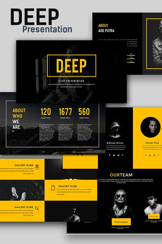
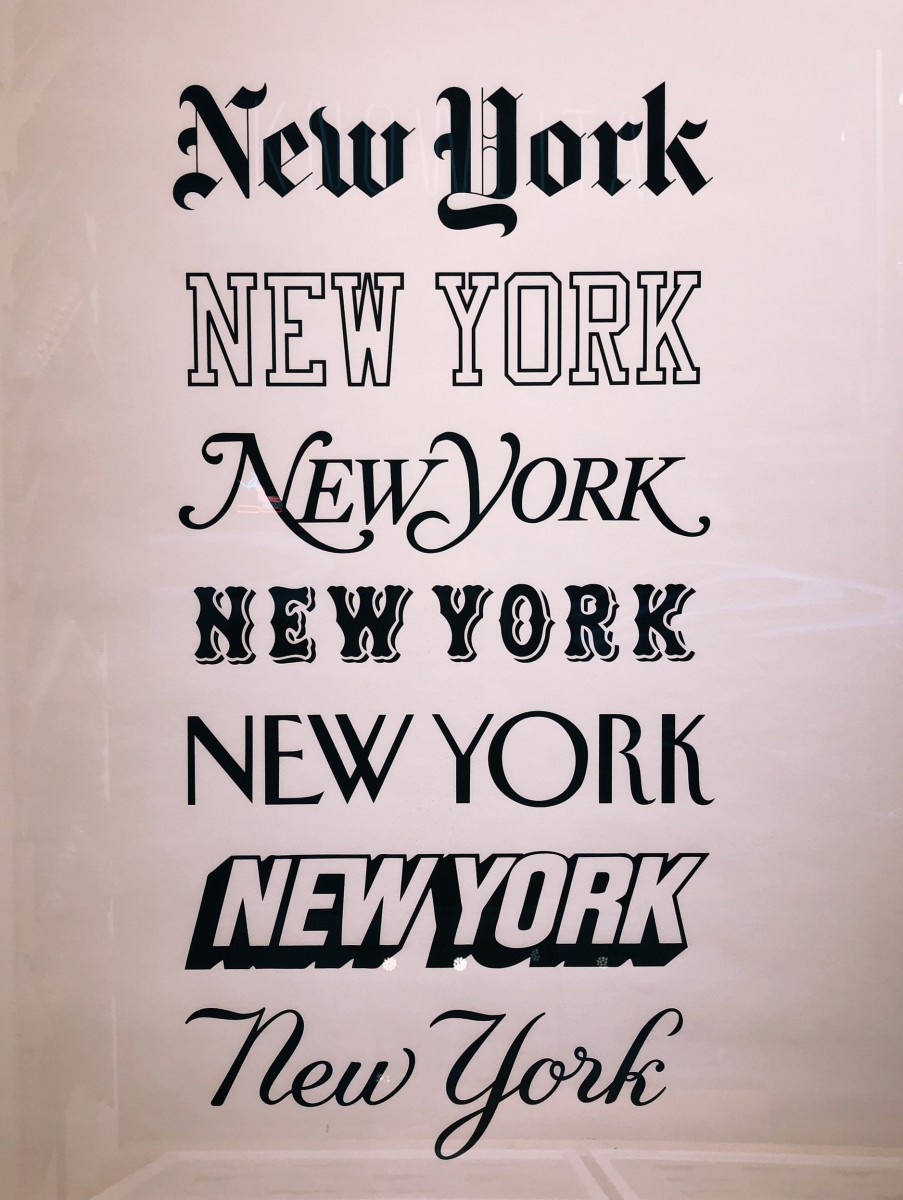
Typography
Typography is one of the key elements in design. The choice and use of fonts directly affect how content is perceived. In some cases, an entire design can be built around typography, especially when a company already has a strong brand style.
What matters is not only the impression of a specific font style but also the combination of different fonts. Sometimes, the simplest font pairings can complement each other and create a powerful effect, while even the most stylish fonts may clash when combined poorly.
Emphasis
Key elements on a website must stand out—the visitor should instantly notice the information the site owner wants to highlight. Not all elements can have the same level of emphasis—primary and secondary focus areas must be clearly defined.
Visual hierarchy can be created using size, color, animation, and unique effects. You can also make a block more appealing with unconventional navigation that invites interaction.
Prioritizing elements effectively comes from a deep understanding of both the client's goals and the needs of the target audience. The overlap between these two gives you the main focus point. It's not just about guiding the user down a desired path, but also genuinely engaging them. The main highlight should reflect the visitor’s need—it must be clear and attractive.
Balance
When designing the structure, it’s important to balance visual elements across the page—not just prioritize their importance. Each component must be harmoniously placed. While it would be easier to achieve this with perfect symmetry, using symmetrical layouts can make designs feel dull. That’s why designers must rely on instinct, taste, and composition knowledge to achieve balance.
Composition
Standard layout rules consider focal points—spots that naturally attract attention first. Important content should be placed in these areas. A common approach is dividing the screen into nine zones using two horizontal and two vertical lines. However, optimal layouts depend on the website’s specific context. Eye movement patterns—like Z or F-shapes—are also helpful when designing.
In addition to emphasis and balance, whitespace is crucial—it helps simplify perception. “Air” in design can sometimes be more valuable than graphic content.
Moderation
Striking the golden mean is often the best solution. This doesn’t mean a boring, generic design—just knowing where to stop. Both a lack and an excess of elements can ruin a page. Too few graphics makes a site feel empty, while overload is tiring and irritating. The same goes for the number of colors, fonts, and interactive features. Minimalist design doesn’t have to be dull—cleanliness doesn't rule out functionality. Even bold, loud designs don’t have to be cluttered.
Attention to Detail
Even the best ideas can be ruined by poor execution. In web design, there’s no place for random elements, unaligned spacing, or inconsistent block sizes. Every detail must be polished. All possible user actions should be mapped out and streamlined. Also, consider differences in browsers, screen formats, and don’t forget a creatively designed 404 page.
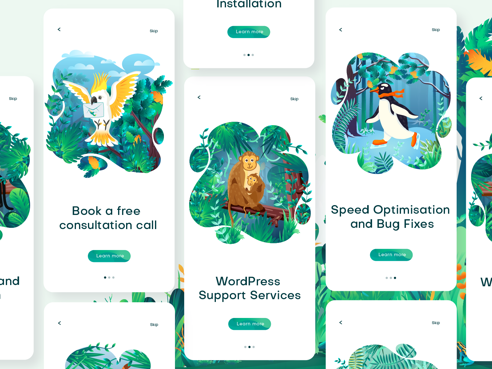
Consistency
Repeating visual elements create a unified and cohesive design. It's essential to maintain consistency in buttons, UI components, and page layouts. This isn't just for aesthetics—it makes navigation easier. Visitors don’t want to search for differences; they want to intuitively recognize and reuse similar elements.
Every page should follow a consistent style. Even if different layouts are required, only minor details should vary. For example, curved lines, color palettes, buttons, and fonts can remain the same while changing backgrounds or animations.
Simplicity
In a creative rush, it’s tempting to go all out—showcase every skill and create something truly unique. Professionals might appreciate the craftsmanship, but average users could get lost in a complex structure.
The goal is to make the site as simple and intuitive as possible. Users should be able to find content easily and take actions naturally. If a site feels too complicated, users will leave in favor of something more familiar. They prefer conventional, user-friendly interfaces.
Making things complex is easy—simplicity is the real challenge. And simplicity, when well-executed, is a true mark of design mastery.
As with other principles, it’s also important to consider cultural and regional preferences. For example, Asian and Arabic websites differ significantly from American and European ones.

How to Apply the Basic Concepts?
When designing, it’s important to continually check your work against these core principles—and ideally, start from them. With experience, applying them becomes second nature. Designers no longer think through every step—they simply do it right, because they’ve internalized good practices. That leaves room for creativity and self-expression.
You can see these web design principles in action in the workshop “Fundamentals of Smart Web Design: Hands-On Practice.”
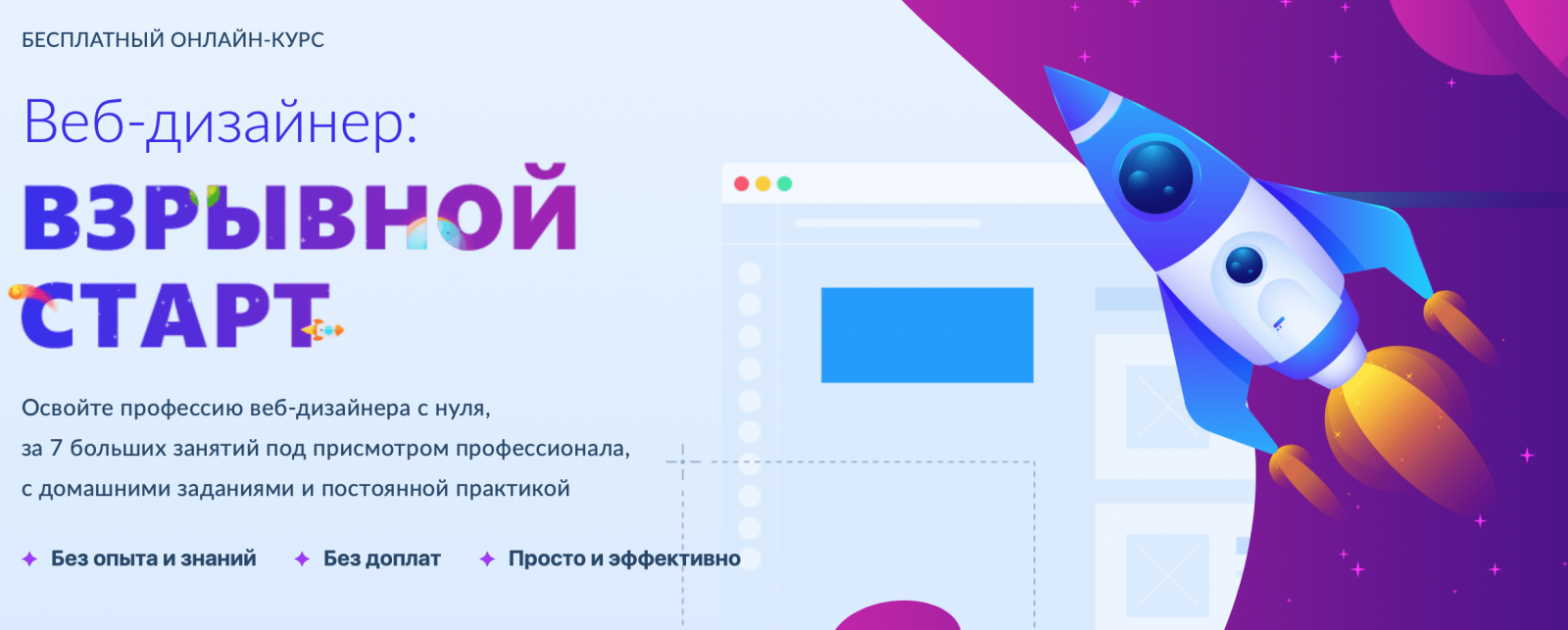
Great designers aren’t born—they’re made. Becoming one requires practice and effort. And that means anyone can learn web design and go pro. A good place to start is the free course “Web Designer: Explosive Start”.
Using the principles above will help you create good work, and as you grow your experience, taste, creativity, and skillset, you’ll be able to add fine detail and become a true professional.