Working on typography for a particular project is one thing—but adding artistic effects to that typography is something else entirely. This type of creativity can be exciting and captivating, but also frustrating and exhausting for web designers. Clients often demand shadows, embossing, gloss—elements that can end up ruining the design aesthetic. Sometimes, it's possible to explain why certain text effects are a bad idea. But not always.
That's exactly why every web designer keeps a small collection of universal typography effects that work well with almost any project, style, or trend combination. They allow you to keep the client happy while making sure the site looks modern and fresh.
In this article, we’ll look at some of these typography effects that can make a design feel alive, bold—and most importantly—client-approved.
The Nature of Artistic Typography Effects
The trick with all typography effects is that they should serve a specific purpose—not be used “just because.” Good typography doesn't need assistance, visual aids, or enhancements with graphics, colors, or buttons. If a chosen font can't work on its own, no effect will fix that. In fact, it may make things worse. The same goes for combining two fonts: if they don’t visually complement each other, no amount of color or retouching will make the text readable or mentally acceptable to the user.
An example of combining multiple effects with our familiar wolf—more on that at the end.

The best typography effects are those that an average user barely notices. Or they’re noticed, but only in a way that highlights the importance of the text. So what effects fit this description?
Shadows
In today's design landscape, the best shadow is one that even the designer barely sees. Shadow techniques work best when they add depth between the text and background, functioning as a kind of “buffer.” For designers, this often means applying the shadow effect in Photoshop—but users shouldn’t be able to tell it’s a shadow. Typically, the shadow is blurred to create a soft element that separates text from background.
No matter the software, never apply default or automatic text shadows. These look amateurish. Take time to adjust the spread, edge hardness, and gradient from dark to light. This helps create a retro, 3D, volumetric, or layered look.
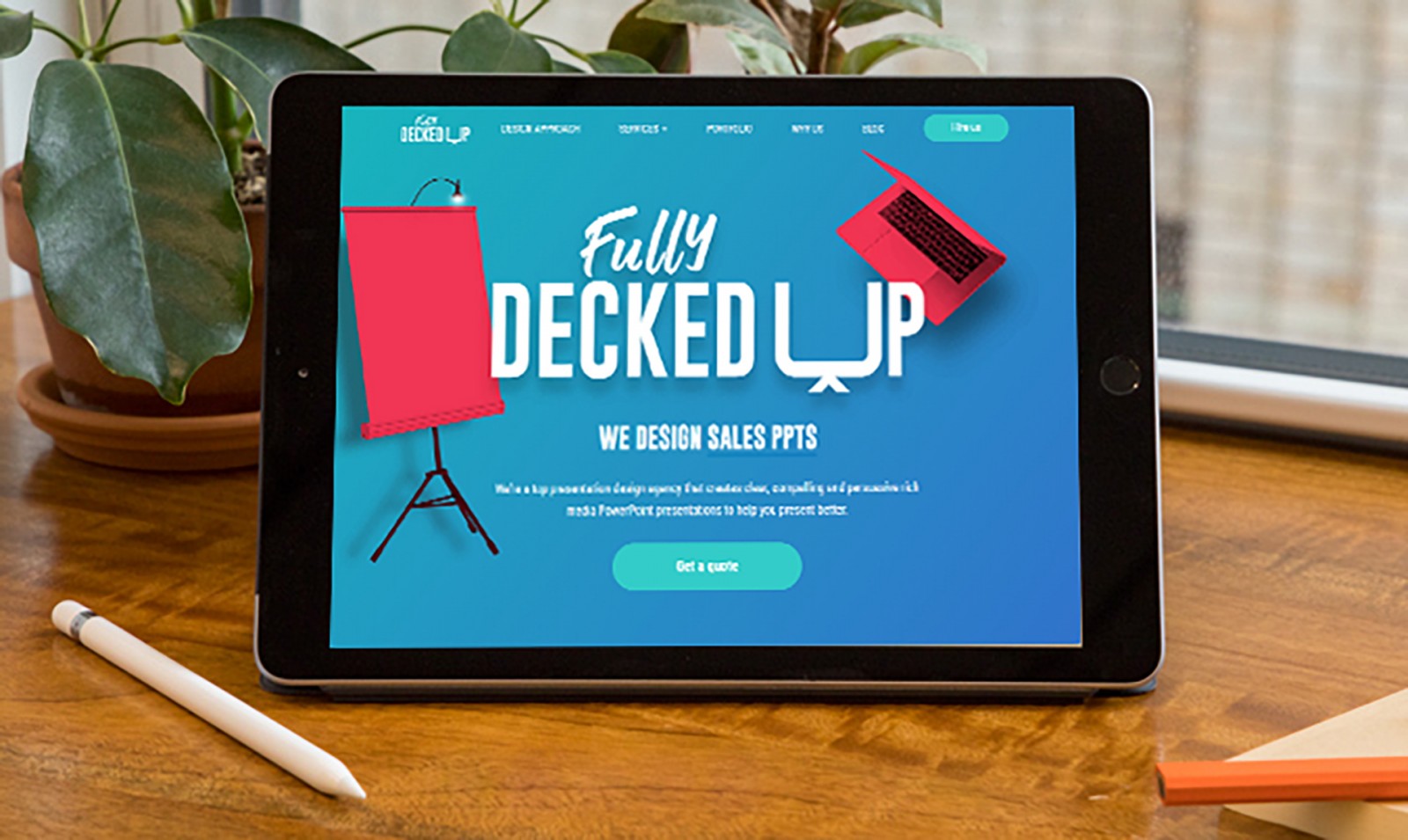
Check out projects like rightwaysigns, Fully Decked Up, Meissl & Schadn, Luminato Festival, den Eelder, and Friluftsland - Danish retail, where shadows are often barely visible, and only on light backgrounds. Still, the design doesn’t feel outdated or overdone. Everything looks strict, clean, even… slightly dull (in a good way).


Brightness, Color, and Neon
Add brightness, gradient, or hatching effects to your text and give it depth. Saturation and weightiness can create a retro feel or replicate the look of neon signs from the past. Neon can feel entirely different when combined with outlines and layered type. This gives the site a new feel and identity. One part of it might feel retro, while another screams “modern neon.”
Sites like cyberpwnkrun, Benji Messmer, Toonami 2018, Urgent, Niika, Soirée Quinze Minutes, and Neon Plus all prove this point. Many of them use a kind of “pseudo-neon” rather than true glowing effects—like Benji Messmer’s layered bright line typography. And that works beautifully.


Texturing the Text
Some fonts are inherently vintage or hand-drawn. Others are enhanced to be more web-friendly. But adding a texture—whether it's an image inside the type or a textured overlay—can make the design more tangible. Texture helps the typography pop, stand out, and feel like the visual centerpiece.
Look at tofinoresortandmarina. Its headline uses a textured style that evokes retro wear and tear. The second part of the header resembles watercolor strokes—semi-transparent and hand-brushed.

The same applies to projects like Belgium WW2, HASSYADAI Inc., LA Homelessness Challenge, Endless Stories, and Xander Beer. Sometimes the texture is intentional to support the historical context, and sometimes it’s just a stylish touch.


When it comes to clean text effects, branding (logos) is the natural route. Brands often tweak or customize a font to add a unique and recognizable symbol to their typography. This isn’t something to apply randomly in every minor design—but it can be incredibly effective for online marketing, rebranding, a design refresh, or updating site headings.
If you’re changing a letter or symbol tied to brand identity, do it carefully—and communicate it to your audience so they don’t think the company has disappeared or been replaced. For best results, it's worth involving the typeface creator or a professional typographer. Not every designer can modify letterforms skillfully. And any such effect should be used sparingly within a single design.
Great examples include brandmeyou, mend-seltzer, lumen-hub, botot, Arrels Restaurant, and murmure. Most branding tweaks here affect only one or two letters, often the first letter—yet the brands remain recognizable, readable, and freshly updated.


Rainbow Coloring
Colored fonts are typefaces that already include multiple colors—not just shades, but hues, gradients, textures, and even transparency. Designers may use ready-made fonts like this watercolor one, create their own, or apply effects manually. (We’ll dive deeper into colored fonts in another article.)

The trick with rainbow-colored text is that all those vibrant colors must stay on the surface of the type. Bright, lively colors are on trend right now, and users won’t see them as tacky—because we’ve gotten used to them over the past year.
Just make sure the color feels natural—like it belongs. Don't put green-red-yellow text over a purple background. That'll blur everything into a mess. You need contrast. And no, painting Helvetica in rainbow colors isn’t the same as using a purpose-made font like Gilbert, or something from Bungee or Guru. But with the right effect, you can get close—and most users won’t notice.


You can see vibrant text effects on bixacolor, Turó, Bikini Moon, Types of Type, Made by Few, and kotobana.


Two Words Before We End…
Don’t forget about double exposure (we discussed it before)—which lets you cut text out of an image to turn it into a headline or logo. You can also combine this with animation or interactivity. And since animation in web design is common now, there’s only one golden rule: Letters must remain readable. Keep animation speeds low, and combine text with simple shapes.
In short, there are many ways to enhance typography artistically—but there are also cases where no effect is the right choice.
Cohesion
When background contrast, font shape, size, and color are properly planned—text and background naturally separate. It can be as hard not to use effects as it is to use them well. But the more contrast variations you have, the easier the text is to read. Plan carefully so all elements work as one. Sometimes all you need is bold text, dark on light, or a few soft tones.

For example, the University of Essex uses bold white type on a deep red background. Similarly, Dreamsdesign, c-m-d, Gino Angelini Foods, and Quantified Planet use strong contrast and skip the fancy effects. But...


Final Thoughts
The problem with text effects is that trends come and go quickly—like long shadows, once popular but now outdated. Heavy, decorative effects can make your design feel old and clumsy. So be careful. Take breaks. Reassess with fresh eyes.
Subtlety is your friend. Keep things light and simple. Every effect should feel like air—barely there. Maybe colored fonts don’t suit a fine-dining website, but how about texture or double exposure? Ditch the neon. Soften the shadow instead. Lift the text gently off the background—just like our wolf example.
That way, clients still get their beloved shadows, embossing, and gloss. And you know you’ve delivered a modern, stylish design—with artistic flair.