Have you ever wondered why many UX designers (user interface designers for websites or mobile applications) previously actively engaged in graphic web design (UI)? Many believe that working on user experience and interface functionality is very challenging. It's much easier to design a grid, place elements and blocks, and scatter icons. But in reality, it's the sense of aesthetics and the ability to decide what works best and is more convenient that provide a solid foundation to move from graphic design to creating UX. Although, even here, many designers encounter "pitfalls." But let's take it step by step... and continue exploring UX ideas .
External Similarity
Graphic design mainly deals with the visual aspect of the entire project design: color, typography, placement of elements in space. UX design pays more attention to creating the product as a whole—how it will be used, how users will interact with it, what steps and stages a user must go through to buy/order something. Both directions can be compared to any item that has a beautiful and colorful wrapper. Humans are made this way: a beautiful wrapper attracts and entices, but whether a person will use the product depends on how it's made inside. That's why project design heavily relies not only on graphic design but also on UX design.

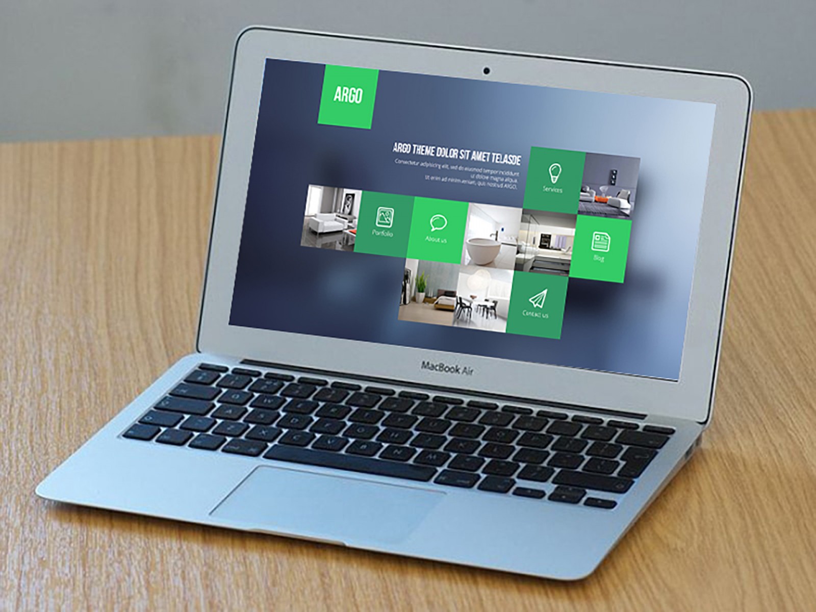
Keeping this in mind, it's the design and visual skills that become the foundation for starting work on creating various UX designs. The project mile27realty is beautiful and convenient, with the designs of both directions closely intertwined.


Subtleties and Nuances
However, this knowledge is usually not enough. As a base, it's good, but not sufficient for full-fledged work. The fact is that working on the user interface includes design psychology, interaction design, and information architecture. All this helps to understand and research user actions and motives, build a content strategy on the site. Yes, it's all quite unusual.
It's impossible to create a convenient and understandable interface without understanding why a user might click here and not there. One needs to understand what might interest them, how to unobtrusively offer it, and so on. No designer can fully learn this overnight by taking on an order.
Pixels or Reflections
The main difficulty in transitioning from graphic design to UX design is changing one's thinking and understanding of tasks. Previously, a web designer thought about grids, colors, typography; now, they need to think about the user, what interests them, why they make certain clicks and not others; why they prefer this site over another with similar themes.
In other words, all new work begins with creating how the new project will function overall, and only then does its graphic visualization begin. That is, first, we write the script, then create the frames, shoot scenes, and create special effects.
A website project should solve the problems of numerous users and offer various opportunities for them to interact with it and want to do so. Undoubtedly, this also heavily depends on the graphic designer, but the UX designer plays a significant role as well.


Can or Cannot
Imagine a situation where you open a beautiful website page and... suddenly don't know what to do on it, where to click, or why. You scroll and scroll, but the content increasingly confuses you.
Good design is a smooth distribution and flow of actions, interactions, and movements from one page to another. But the goal of a UX designer is to think everything through so that visitors can reach the necessary information through different paths.
That's why calls to action become the main elements on pages. This way, users understand the purpose of each page individually and what they will get/see if they click a button, fill out a form, or purchase a product. UX design, in this case, may include external elements to encourage clicks, sharing on social networks, leaving reviews, and more.
In this case, the interface of the project getvinebox is interesting. Its design overall looks familiar but is visually arranged so that users don't immediately realize it. At the same time, there are multiple understandable buttons, links, and separate menu items. Even under the feature cards, there's not just an arrow (like, scroll further) but a small explanation: Discover more . Naturally, with such a call, many more users will click the link.


The project laab-walde is also interesting, where each category card has an arrow-link, additionally explaining that you can click and learn more information.

Behind the beautiful design lies functionality.
Many Elements or Few
Don't drown in the project by using super-duper cool elements and effects everywhere possible. If there's one good and suitable illustration, use it. But don't clutter the surrounding space with small-sized images, even if they also fit thematically.
This applies to all design elements in general (graphic or UX), even to icons and symbols, which are most important for attracting user attention. The task of the user interface and experience is to encourage more clicks, more transitions, more orders, but not to overload the user with excessive information. Therefore, the joint actions of the graphic designer and UX designer are always aimed at thinking through when a larger number of elements is appropriate and when it's not, how to place and "play" with this quantity.
The best option, in this case, is the idea of a small strategy. That is, using only those elements that are necessary. If the UX designer can't figure out what's really needed, it's easiest to try removing one or two elements from each page and see what happens. Is it still convenient?
Here's a clear example of the project artloversaustralia , which has an incredibly large amount of content. But each slider image on the main page has its own significance. One talks about a festival, another offers to visit the store, a third suggests subscribing and getting a discount, and so on. Yes, there's a large menu that transitions into a "hamburger" option, several icons, and examples of art works. But the main thing is that despite the abundance of content, the design doesn't feel overloaded. All information is sorted, distributed, and tucked away, yet remains accessible and seemingly "at hand."


Also, pay attention to madebywest , which not only has animation (better to see for yourself) but also light asymmetry, allowing visual separation of content parts from each other and giving the eyes a chance to study it calmly and measuredly.

Mobile Interaction
Few dispute the fact that websites should be created based on responsiveness. But using only a responsive template for a site is not enough, as the entire site structure must be precisely adjusted for different screens. Unfortunately, this is too often ignored.
As a result, some projects, ::contentReference[oaicite:1]{index=1}
You shouldn’t drown your project in every imaginable super-fancy element and effect. If you have one good and fitting illustration — use it. But don’t clutter the space around it with lots of small images, even if they also match the theme.
This applies to all design elements in general (whether graphic or UX), even to icons and symbols, which are often the most important for catching the user's attention. The goal of a user interface and user experience is to encourage more clicks, more interactions, more purchases — but not to overload the user with excessive information. That’s why graphic designers and UX designers always collaborate to decide when more elements are appropriate and when they’re not, how to arrange them, and how to “play” with their quantity.
The best option here is what we’d call a “minimal strategy” — using only the elements that are truly necessary. If the UX designer isn’t sure what’s actually needed, it’s easiest to simply try removing one or two elements from each page and seeing what’s left. Is it still usable? Does it feel right?
A great example is the project artloversaustralia, which contains an enormous amount of content. But each slider image on the homepage has its own purpose. One tells you about a festival, another promotes the store, a third invites you to subscribe and get a discount, and so on. Yes, there’s a large menu that turns into a hamburger menu, several icons, and samples of artworks. But despite the content overload, the design doesn’t feel cluttered. All information is sorted, well-structured, and tucked into place — but remains accessible and almost feels “at your fingertips.”
Take a look at madebywest as well. Not only does it feature animation (worth checking out yourself), but it also uses subtle asymmetry that visually separates content sections from each other, making the browsing experience calmer and more relaxed.
Mobile Interaction
Nobody argues with the fact that websites today must be responsive. But using a generic responsive template isn’t enough — the entire site layout should be carefully adjusted for various screen sizes. Sadly, this part is often neglected.
As a result, we often see sites that look great on desktop, but on mobile have terrible typography, poorly scaled images, and disproportionate elements. Even if this only happens on certain pages, it still frustrates users.
That’s why both graphic and UX designers should spend extra time working specifically on the mobile version. This helps ensure that the mobile site is better balanced, more intuitive, and not just visually polished — but actually usable.
For example, look at the project AND CO. The desktop version is wide and spacious, even though there’s not much text. It features two buttons (in the center and top right), a few icons, and nice animations further down the page (you should definitely check it out). But once opened on mobile, the site offers some interesting and well-thought-out decisions.


The buttons are different — now prompting the user to immediately download the mobile app. And when you keep scrolling, those two buttons stay in view at the bottom of the screen as a fixed panel. On inner pages, the typography remains... comfortable. Reading small text on mobile is no fun, so the developers made it nice and big. Maybe even too big — but even on desktop it’s not small either. Why? Because on screens with higher resolution, the font size adapts downward. 1080p is no longer cutting-edge — many users have even larger screens. But we’ve already discussed that separately.


Alignment
Speaking of large text — one more key aspect of UI design is element alignment. Technically this relates to graphic design, but it’s also very relevant to UX.
Left, center, right, justified — we won’t go too deep into which alignment style is best for web design. But here’s the point: alignment must be consistent. Elements should follow a grid. No uneven edges allowed.
To plan and build text blocks properly in mockups, use Lorem Ipsum paragraphs. You can read more from Artemy Lebedev or check out the Wikipedia entry, and generate placeholder text using lipsum. These dummy texts help layout and style everything visually, using the actual font, kerning, padding, bolding, alignment, etc.
Look at cubavodka and catchfishandchips — both align text to the left, while their content blocks appear sometimes on the right, sometimes on the left. Even though there are menu elements at the top and bottom, the main body text remains left-aligned. This creates a visual hierarchy and guides the eyes smoothly down toward the images.


Also, notice the consistent alignment on twindolphinloscabos.


Opinions and Feedback
When you create graphic design, you just publish it online — and often never find out whether users liked it, whether it was functional, or if it worked as intended. Designers rarely receive feedback or have metrics to evaluate their designs. UX design, on the other hand, thrives on feedback. That’s why user opinions and behavior research are essential. There are many methods, tools, and frameworks for this. Honestly, this can become one of the most fascinating and rewarding parts of UX design.
That’s why you’ll often see not just social media icons that say “we’re here,” but direct requests for feedback: leave a review, share your thoughts, ask questions. And it doesn’t matter whether it’s about a product or reporting a broken link — designers and site owners want to know everything. They value that connection with users.
For example: risere offers multiple contact options for different purposes. portofmokha integrates a chat and contact email. Even Suzuki Hellas, focused on car sales, provides several communication channels.


On the other hand, take a real estate sales site like bbg-fl. Their goal is purely to sell. They have minimal feedback options — only if you’re directly interested in a listing.


Where to Start
Transitioning into UX should be gradual. Start simple. Try creating new interfaces based on existing projects. Start from scratch and redesign them with your own ideas — maybe you’ll come up with something even better. For inspiration, check out dailyui — they offer daily UI design prompts, and your work can be reviewed by pros. But go deeper. Don’t just redesign the UI — try creating an entirely new user experience for the same concept. You’ll see: the result will be completely different.

Conclusion
The UX design field is growing every hour, and many graphic designers are trying — if not to switch entirely — at least to explore it. But no matter how solid your base is, mastering UX still takes time, study, and lots of practice.
Some may confuse graphic design, UX, UI, interaction design, and so on. Let’s clarify: UX comes first — it defines the macro-level experience, how the product (like an Australian artist portfolio) will be presented online, the project’s logic, the structure of each page. Only after that comes UI design — where visual artists arrange elements, draw them, apply effects. Meanwhile, the UX designer continues testing what’s being built, ensuring the visual layer supports the original intent. That’s the general idea.
That’s why graphic designers already have a strong foundation for working in UX — for analyzing and improving what they create visually. Sure, mistakes happen, and questions arise. But you can always learn, talk to peers, build your community, and share your ideas with users.