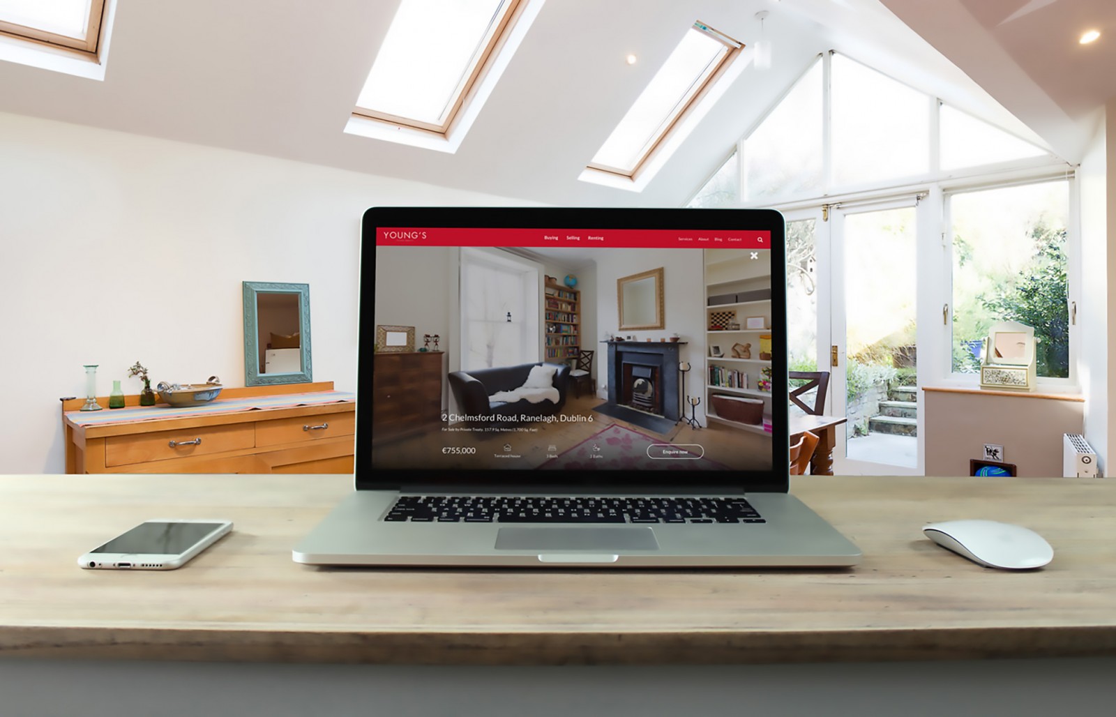
Depth in web design is a beautiful effect that can give a website both uniqueness and appeal, bringing joy not only to the site owner but also to its creator. Moreover, the depth effect adds realism—even though visitors know they’re looking at part of the virtual world.
Beyond aesthetics, depth can also solve more serious tasks in web design. It can draw attention to specific elements or information, organize the workspace, and even create a clear interface structure on the page. Think back to some of your past projects or websites you’ve visited—are they completely flat in design? Or did they use depth effects that made them stand out to you, even if you didn’t consciously realize why?
The most interesting part is that creating such an effect isn’t difficult. Below, we’ll explain several techniques for adding “depth” to website design—techniques suitable for both beginners and experienced designers, even during an era when flat design is trending.
Perspective
Perhaps the most striking and illustrative method for achieving a depth effect in web design. It works well both visually and aesthetically. Despite trends and styles, clients often want a unique or “interesting” design. That’s where perspective can help—even if it’s only used on the homepage.
There are many examples of combining perspective with flat design. Creating perspective requires not only artistic vision but also a solid grasp of geometry—equal angles, horizontal alignment, proportionality, and especially how angles change based on distance. These principles come from basic geometry and art lessons.
The examples below showcase vivid uses of perspective combined with parallax effects (outdoorbergen.no), menu navigation, and even the project realclear.com.tw, where each vertically scrolling section represents a different interior, with clickable objects inside.


Ribbons
Wrapping-style ribbons are popular in Western web design, as they easily add three-dimensionality to a website. On the screenshot of cabedge.com, you can spot a small ribbon in the center featuring an apple as a logo. This example is particularly interesting—it has a beveled button in the corner, modern flat design elements, and lots of thoughtful details.

Other examples show how ribbons are used to decorate portfolios or the top of a page.


Web designers use ribbons for headers, blog dates, or product highlights—anywhere that requires emphasis. Take a close look at your own site and consider: what’s the most important information, and which parts might be getting lost in the layout?
Interface
Depth effects are often created using beveled buttons (see cabedge.com above), text shadows, and gradient elements. But it’s important not to overload the interface visually. If used subtly, these elements help focus the user’s attention without distraction.
Consider the example from atibamobile.com below. The designer used large round buttons styled as inset icons, as well as a rectangular button with gradient fill, giving it volume. The overall design is modern and trendy.

There’s a downside to realistic interface styling. Designers sometimes overdo shadows and gradients, creating cluttered, unattractive results. To achieve realism, shadows should be subtle—just enough to accent a button’s edge.

Image Overlays
Sometimes, buttons, ribbons, and perspective just aren’t appropriate. That’s when image overlay with light shadowing can create a realistic 3D effect. This approach works with adaptive design and pairs well with flat styles.

It’s appealing to users because their eyes naturally gravitate toward the most important content—like news feeds, events, or posters. On humcreative.com, image overlays with shadows indicate interactive elements. In another example, depth is achieved using a photo with a layered text block. Both sites are flat and fast-loading.


Shadow Effects
Shadow usage is still very popular. Nearly every example in this article makes use of it. Above, we looked at subtle applications—now let’s focus on more pronounced ones.
Creating realism is fairly simple here. Start with an image (like a character or tablet) and apply a Drop Shadow effect to its layer in Photoshop. You’ll need to adjust the angle, distance, and intensity of the shadow to simulate reflection or shadow casting. Just make sure shadows are consistent—for example, on dascolabarbers.com, all figures and chairs should cast shadows in the same direction.

The project funrock.com shows a combined shadow effect used with flat design. The content block casts a central shadow, while the watchtower image overlaps both the content and page background, creating depth.

Conclusion
The use of depth in web design isn’t always about aesthetics. Sometimes shadows or ribbons simply don’t suit the overall style. Still, with modern trends leaning toward flat design and minimalism, techniques like light shadows , layering, and perspective are no longer considered out of place. When done correctly, they won’t slow down your site—and they enable responsive design that looks great on mobile devices.